建立結構化多區塊網格#
在探索多維度資料時,一個有用的方法是在資料集的不同子集上繪製重複的同個區塊圖。這項技術有時稱為「格子」或「平鋪」繪圖,它與「小倍數」的概念有關。它允許觀看者快速從複雜的資料集中萃取大量的資訊。Matplotlib 提供良好的支援來製作具有多軸的圖形;Seaborn 在其上進行建構以直接連結圖形結構至資料集結構。
圖形層級 函數建構在教學課程章節中討論的物件上。在大部分情況下,您會想要使用這些函數。它們會處理一些重要的帳務處理,以同步每個網格中的多個區塊圖。此章節說明基礎物件是如何運作的,這對於進階應用可能會很有用。
條件小倍數#
在您想要視覺化變數的分配或資料集內部分類中多變數間的關係時,FacetGrid 類別很有用。可以繪製具最多三個向度的 FacetGrid:row、col 和 hue。前兩個向度顯然與產生的軸矩陣有關;將色調變數想成沿著深度軸的第三個向度,不同階層會使用不同的色彩繪製。
每個 relplot()、displot()、catplot() 和 lmplot() 會在內部使用這個物件,且它們完成時會回傳這個物件,讓這個物件可供進一步調整使用。
這個類別會初始化 FacetGrid 物件,其中包含表格框和變數名稱,這些變數名稱用於形成網格的列、欄或色調向度。這些變數應該是分類的或離散的,然後該變數各個階層的資料都將用於沿著該軸的區隔。例如,假設我們想要檢查在 tips 資料集中的午餐和晚餐之間的差異
tips = sns.load_dataset("tips")
g = sns.FacetGrid(tips, col="time")
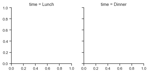
使用這種方式初始化網格會設定 matplotlib 圖形和軸,但並不會在它們上繪製任何內容。
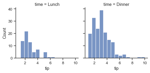
在這個網格上視覺化資料的主要方法是透過 FacetGrid.map() 方法。提供一個繪製函式和要繪製表格框中的變數名稱。我們使用直方圖來檢視每個這些子集中的提示分配
g = sns.FacetGrid(tips, col="time")
g.map(sns.histplot, "tip")
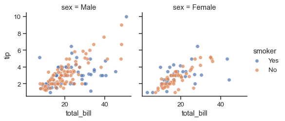
此函數將繪製圖形並標註座標軸,希望在一個步驟中產生完成的繪圖。若要建立關係繪圖,只需傳入多個變數名稱。您也可以提供關鍵字參數,這些參數將傳給繪圖函數
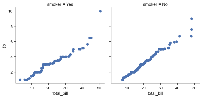
g = sns.FacetGrid(tips, col="sex", hue="smoker")
g.map(sns.scatterplot, "total_bill", "tip", alpha=.7)
g.add_legend()
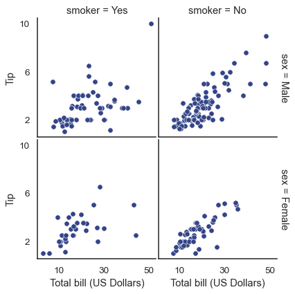
有幾個選項可以控制方格的外觀,這些選項可以傳給類別建構函數。
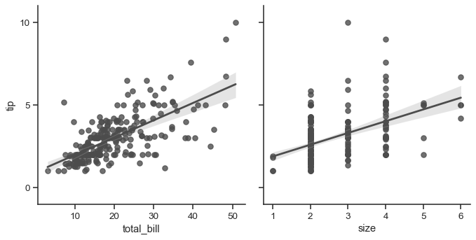
g = sns.FacetGrid(tips, row="smoker", col="time", margin_titles=True)
g.map(sns.regplot, "size", "total_bill", color=".3", fit_reg=False, x_jitter=.1)
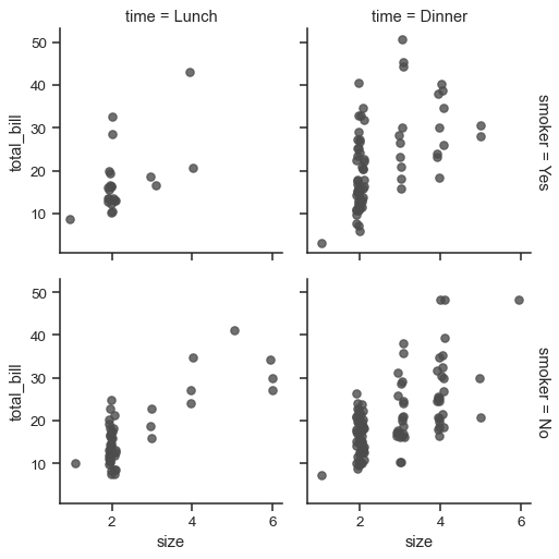
請注意,margin_titles 在 matplotlib API 中並未被正式支援,而且並非於所有情況下都適用。特別是,它目前無法與位於繪圖外部的圖例一起使用。
圖形的尺寸是藉由提供每個刻面的高度以及長寬比例來設定的
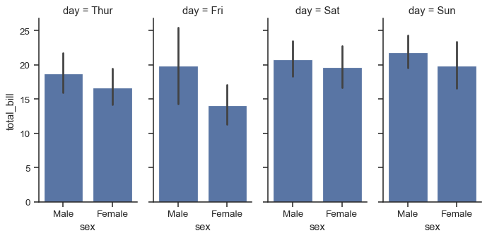
g = sns.FacetGrid(tips, col="day", height=4, aspect=.5)
g.map(sns.barplot, "sex", "total_bill", order=["Male", "Female"])
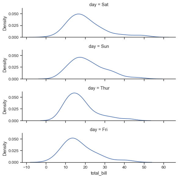
刻面的預設排序是根據 DataFrame 中的資訊衍生的。如果用於定義刻面的變數為類別型別,則會使用類別的順序。否則,刻面將按照類別等級的出現順序。然而,可以透過適當的 *_order 參數指定任何刻面向度的排序
ordered_days = tips.day.value_counts().index
g = sns.FacetGrid(tips, row="day", row_order=ordered_days,
                  height=1.7, aspect=4,)
g.map(sns.kdeplot, "total_bill")
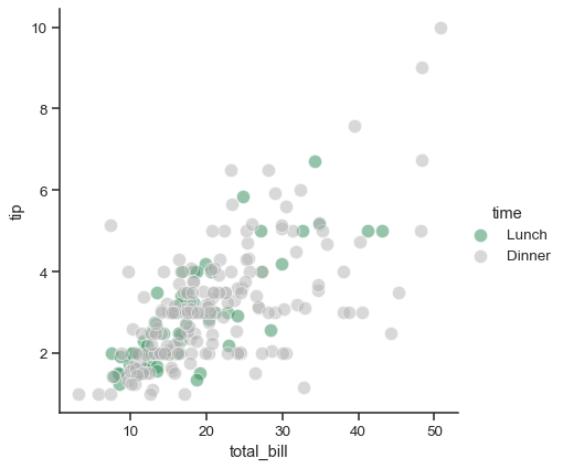
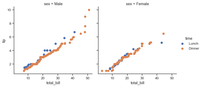
可以提供任何 seaborn 色彩盤 (換句話說,可以傳給 color_palette() 的東西)。您也可以使用將 hue 變數中的值的名稱對應到有效 matplotlib 色彩的字典
pal = dict(Lunch="seagreen", Dinner=".7")
g = sns.FacetGrid(tips, hue="time", palette=pal, height=5)
g.map(sns.scatterplot, "total_bill", "tip", s=100, alpha=.5)
g.add_legend()
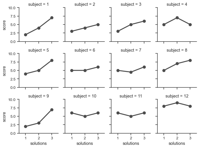
如果您有一個變數有多個等級,您可以沿著欄位繪製它,但「換行」它們,以便它們橫跨多列。執行此操作時,您無法使用 row 變數。
attend = sns.load_dataset("attention").query("subject <= 12")
g = sns.FacetGrid(attend, col="subject", col_wrap=4, height=2, ylim=(0, 10))
g.map(sns.pointplot, "solutions", "score", order=[1, 2, 3], color=".3", errorbar=None)
一旦您使用 FacetGrid.map() (可以多次呼叫) 繪製繪圖,您可能想調整繪圖的某些面向。在 FacetGrid 物件上也有許多方法可在更抽象的層級操作圖形。最通用的方法是 FacetGrid.set(),還有其他的更專業的方法,例如 FacetGrid.set_axis_labels(),它會接受內部刻面沒有座標軸標籤的事實。例如
with sns.axes_style("white"):
    g = sns.FacetGrid(tips, row="sex", col="smoker", margin_titles=True, height=2.5)
g.map(sns.scatterplot, "total_bill", "tip", color="#334488")
g.set_axis_labels("Total bill (US Dollars)", "Tip")
g.set(xticks=[10, 30, 50], yticks=[2, 6, 10])
g.figure.subplots_adjust(wspace=.02, hspace=.02)
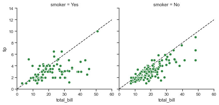
如果要進行更多自訂,你可以直接處理底層 matplotlib Figure 和 Axes 物件;這些物件分別儲存在成員屬性 figure 和 axes_dict 中。在製作沒有列或欄分割區的圖形時,你也可以使用 ax 屬性直接存取單一軸。
g = sns.FacetGrid(tips, col="smoker", margin_titles=True, height=4)
g.map(plt.scatter, "total_bill", "tip", color="#338844", edgecolor="white", s=50, lw=1)
for ax in g.axes_dict.values():
    ax.axline((0, 0), slope=.2, c=".2", ls="--", zorder=0)
g.set(xlim=(0, 60), ylim=(0, 14))
使用自訂函數#
在使用 FacetGrid 時,你並不受限於現有的 matplotlib 和 seaborn 函數。但是,任何你使用的函數都必須遵循一些規則才能正確運作。
函數必須繪製在「目前作用中」的 matplotlib
Axes中。對於matplotlib.pyplot命名空間中的函數,這將成立;而且,如果你想直接操作Axes的方法,你可以呼叫matplotlib.pyplot.gca()以取得目前Axes的參考。函數必須在位置引數中接受用於繪製資料的引數。在內部,
FacetGrid會傳遞一個Series資料,針對傳遞給FacetGrid.map()的每個已命名位置引數。函數必須能夠接受
color和label關鍵字引數,理想狀況是它會以有用的方式使用這些引數。在多數情況下,最簡單的做法是擷取**kwargs的一般字典,然後將它轉傳給底層繪圖函數。
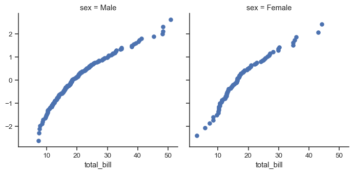
我們來看看你可以用來繪製圖形的最簡範例函數。這個函數只會取用每個分區中的單一資料向量。
from scipy import stats
def quantile_plot(x, **kwargs):
    quantiles, xr = stats.probplot(x, fit=False)
    plt.scatter(xr, quantiles, **kwargs)

g = sns.FacetGrid(tips, col="sex", height=4)
g.map(quantile_plot, "total_bill")
如果你想製作雙變量圖形,你應該撰寫函數,讓它先接受 x 軸變數,再接受 y 軸變數。
def qqplot(x, y, **kwargs):
    _, xr = stats.probplot(x, fit=False)
    _, yr = stats.probplot(y, fit=False)
    plt.scatter(xr, yr, **kwargs)

g = sns.FacetGrid(tips, col="smoker", height=4)
g.map(qqplot, "total_bill", "tip")
因為 matplotlib.pyplot.scatter() 接受 color 和 label 關鍵字引數並對它們執行正確的處理,所以我們可以輕鬆地新增一個色相切面
g = sns.FacetGrid(tips, hue="time", col="sex", height=4)
g.map(qqplot, "total_bill", "tip")
g.add_legend()
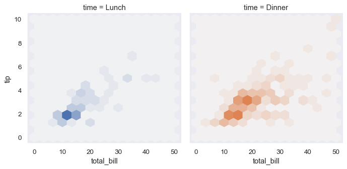
不過有時你會想要映射一個函式,而這個函式無法按照你預期的方式運作於 color 和 label 關鍵字引數。這種情況下,你會想要明確地捕捉到它們並在你自訂函式的邏輯中處理它們。例如,這個方法允許我們映射 matplotlib.pyplot.hexbin(),否則它無法順利與 FacetGrid API 一起使用
def hexbin(x, y, color, **kwargs):
    cmap = sns.light_palette(color, as_cmap=True)
    plt.hexbin(x, y, gridsize=15, cmap=cmap, **kwargs)

with sns.axes_style("dark"):
    g = sns.FacetGrid(tips, hue="time", col="time", height=4)
g.map(hexbin, "total_bill", "tip", extent=[0, 50, 0, 10]);
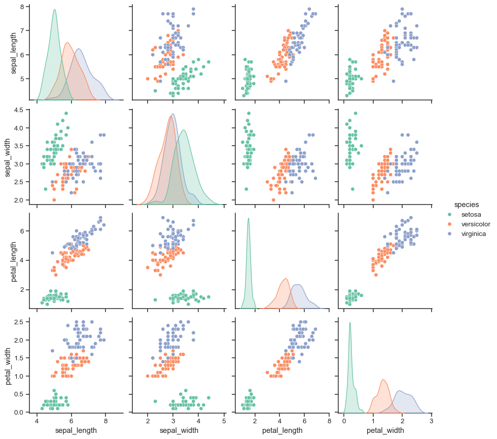
繪製成對的資料關聯性#
PairGrid 也允許你快速使用相同的繪製類型繪製一個小部分圖的網格,並在每個小部分圖中視覺化資料。在一個 PairGrid 中,每一欄和每一行會被指定給不同的變數,因此產生的繪圖會顯示資料集中的每個成對關聯性。這種繪圖類型有時稱為「散佈點矩陣」,因為這是顯示每個關聯性的最常見方式,但 PairGrid 並不侷限於散佈圖。
瞭解 FacetGrid 和 PairGrid 之間的差異非常重要。在前者,每個切面會顯示同樣的關聯性,但根據不同層級的其他變數進行判斷。在後者,每個繪圖顯示的都是不同的關聯性(儘管上三角形和下三角形會擁有鏡射繪圖)。使用 PairGrid 可以讓你非常快速地總結出資料集中有趣的關聯性的概略。
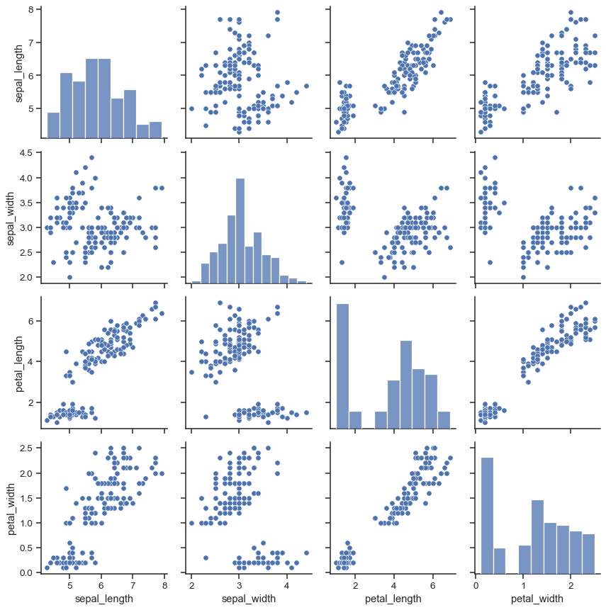
類別的基本使用方式非常類似於 FacetGrid。首先,初始化網格,然後傳遞函式繪製到 map 方法,它會在每個子圖表上呼叫。也有相關函式,pairplot() 透過放棄一些彈性,以求更快的繪製速度。
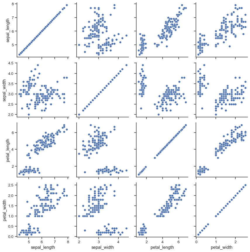
iris = sns.load_dataset("iris")
g = sns.PairGrid(iris)
g.map(sns.scatterplot)
可以在對角線上繪製不同的函數,以顯示每個欄位變數的單變量分配。不過,請注意,軸刻度不會對應到這個圖表的計數或密度軸。
g = sns.PairGrid(iris)
g.map_diag(sns.histplot)
g.map_offdiag(sns.scatterplot)
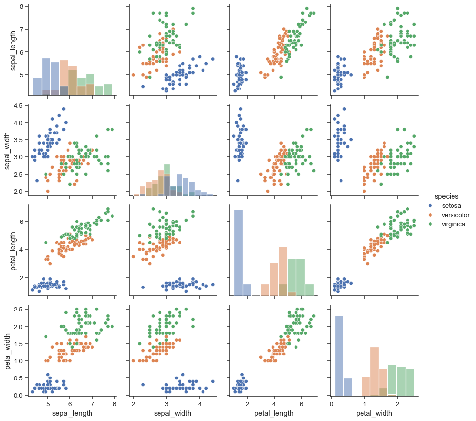
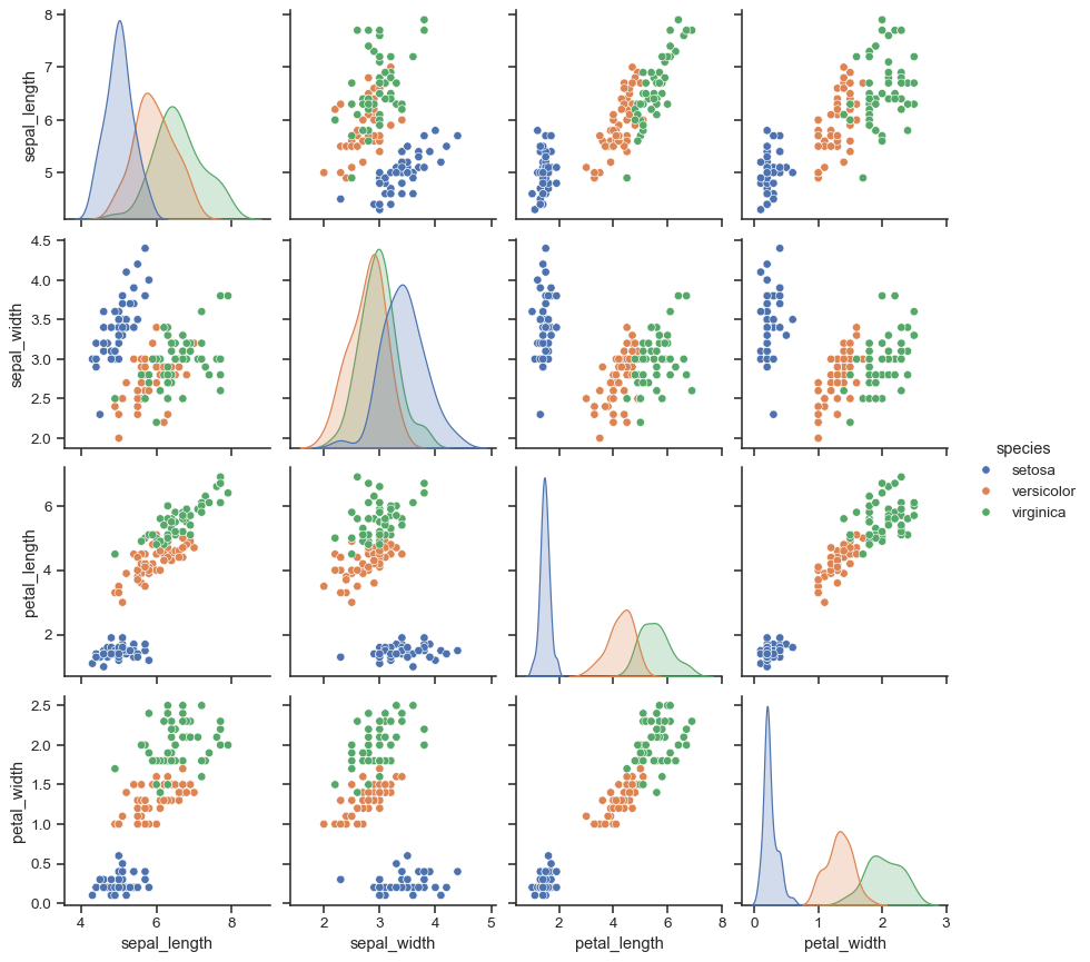
使用此圖表的常見方式是使用分開的分類變數為觀察值上色。例如,鳶尾花資料集對三種不同鳶尾花品種執行四項測量,因此您可以看到它們的差異。
g = sns.PairGrid(iris, hue="species")
g.map_diag(sns.histplot)
g.map_offdiag(sns.scatterplot)
g.add_legend()
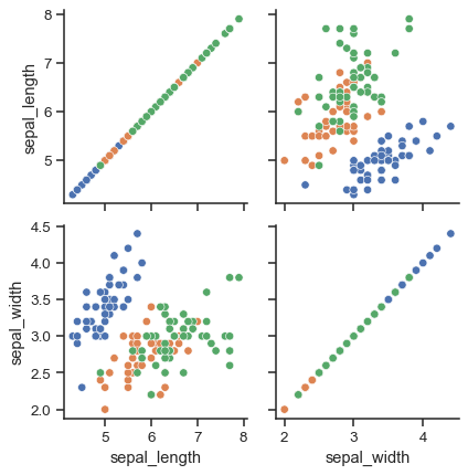
預設情況下,會使用資料集中的每個數字欄位,但您可以依需要專注於特定關係。
g = sns.PairGrid(iris, vars=["sepal_length", "sepal_width"], hue="species")
g.map(sns.scatterplot)
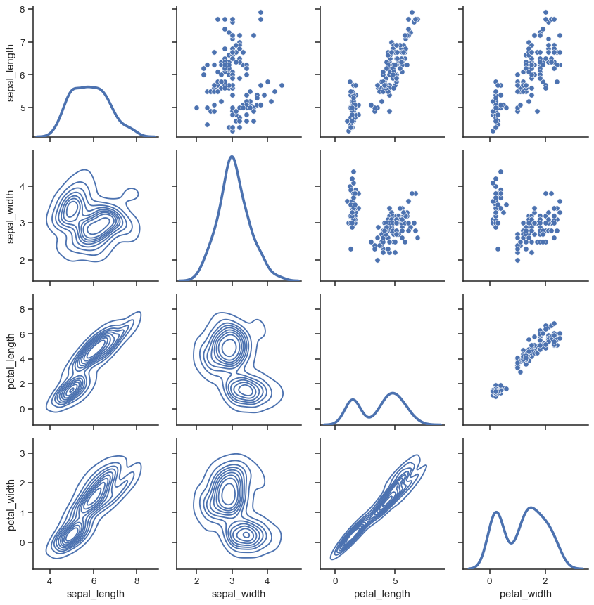
也可以在上三角形和下三角形使用不同的函數,以強調關係的不同面向。
g = sns.PairGrid(iris)
g.map_upper(sns.scatterplot)
g.map_lower(sns.kdeplot)
g.map_diag(sns.kdeplot, lw=3, legend=False)
對角線上具有相同關係的正方形網格實際上只是一個特例,您可以使用不同的變數在列和欄繪製圖形。
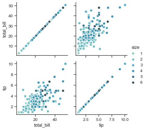
g = sns.PairGrid(tips, y_vars=["tip"], x_vars=["total_bill", "size"], height=4)
g.map(sns.regplot, color=".3")
g.set(ylim=(-1, 11), yticks=[0, 5, 10])
當然,美學屬性是可以設定的。例如,您可以使用不同的色盤(例如,顯示 hue 變數的排序)將關鍵字引數傳遞到繪製函式中。
g = sns.PairGrid(tips, hue="size", palette="GnBu_d")
g.map(plt.scatter, s=50, edgecolor="white")
g.add_legend()
PairGrid 具有彈性,但要快速瀏覽資料集,使用 pairplot() 會更容易。這個函式預設使用散佈圖和直方圖,雖然還會新增其他幾種類型(目前,您也可以在非對角線上繪製迴歸圖,在對角線上繪製 KDE)。
sns.pairplot(iris, hue="species", height=2.5)
也可以使用關鍵字引數控制圖表的樣式,它會傳回 PairGrid 實例,以供後續調整。
g = sns.pairplot(iris, hue="species", palette="Set2", diag_kind="kde", height=2.5)