seaborn.objects 介面#
在版本 0.12 中推出了 seaborn.objects 名稱空間,作為繪製 seaborn 繪圖的全新介面。它提供更一致且彈性的 API,包含一系列可組合的類別,用於轉換和繪製資料。與現有的 seaborn 函數相反,新的介面旨在支援端對端繪圖規格和自訂,而不需要使用 matplotlib(但如有需要,仍可執行此操作)。
注意
目前,物件介面仍為實驗性質,且尚未完善。雖然已穩定到足以正式使用,但肯定還有一些粗糙的邊緣和遺漏的功能。
指定繪圖並對應資料#
應該使用以下慣例匯入物件介面
import seaborn.objects as so
可以使用 seaborn.objects 名稱空間來存取所有相關類別。最重要的類別是 Plot。您可以透過實例化 Plot 物件並呼叫其方法,來指定繪圖。以下是簡單範例
(
    so.Plot(penguins, x="bill_length_mm", y="bill_depth_mm")
    .add(so.Dot())
)
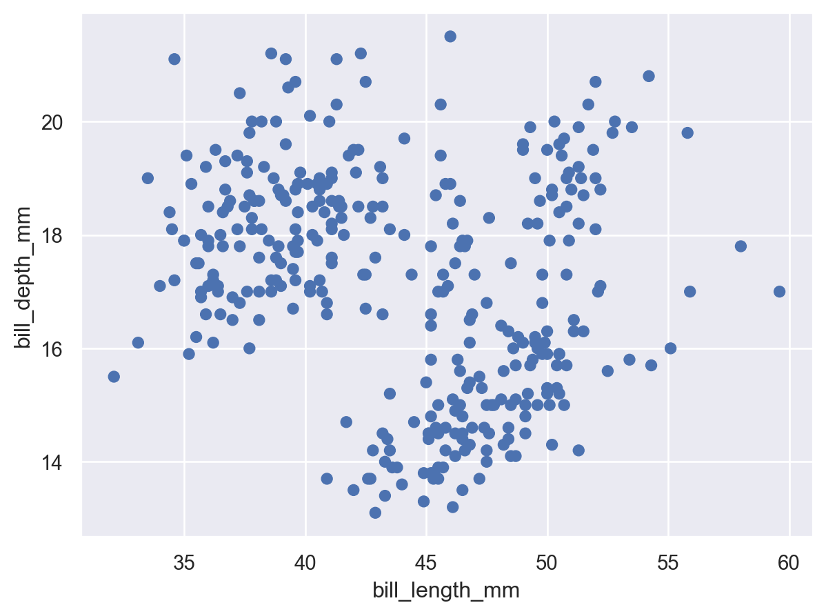
製作散佈圖的此程式碼,看來應該相當熟悉。就像使用 seaborn.scatterplot() 一樣,我們傳入整理過資料框 (penguins),並將其中兩欄指定為此圖形的 x 及 y 座標。但這裡我們沒有從圖形類型開始,再增加一些資料指定,而是從資料指定開始,再加入圖形元素。
設定屬性#
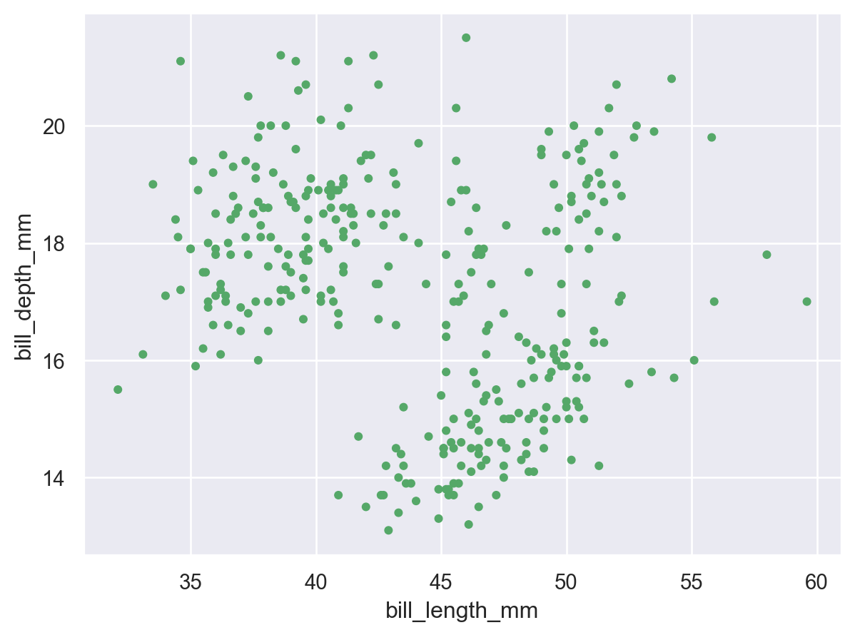
Dot 類別是 Mark 的範例:圖形化呈現資料值的一個物件。各記號都有一些屬性可以設定,以變更其外觀
(
    so.Plot(penguins, x="bill_length_mm", y="bill_depth_mm")
    .add(so.Dot(color="g", pointsize=4))
)
對應屬性#
與 seaborn 的函數一樣,我們也可以將資料值對應到各種圖形屬性
(
    so.Plot(
        penguins, x="bill_length_mm", y="bill_depth_mm",
        color="species", pointsize="body_mass_g",
    )
    .add(so.Dot())
)
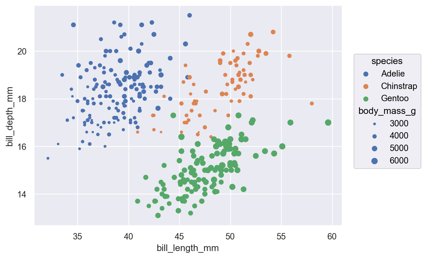
雖然此基本功能並不新穎,但與函數 API 相比,一個重要的差異在於,使用與將屬性直接設為相同的參數名稱來對應屬性(而不是使用 hue 相對於 color 等)。重要的是屬性定義在哪裡:在初始化 Dot 時傳入值會直接設定屬性,而在設定 Plot 時指定變數則會對應相對應的資料。
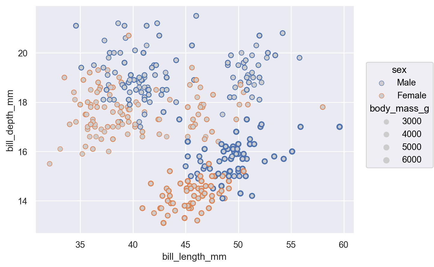
除了此差異之外,物件介面也允許對應更廣泛的記號屬性
(
    so.Plot(
        penguins, x="bill_length_mm", y="bill_depth_mm",
        edgecolor="sex", edgewidth="body_mass_g",
    )
    .add(so.Dot(color=".8"))
)
定義群組#
Dot 記號獨立呈現各資料點,因此將變數指定至屬性只會變更各點的外觀。對於將觀察結果群組化或連接起來的記號(例如 Line),它也會決定圖形元素的數量
(
    so.Plot(healthexp, x="Year", y="Life_Expectancy", color="Country")
    .add(so.Line())
)
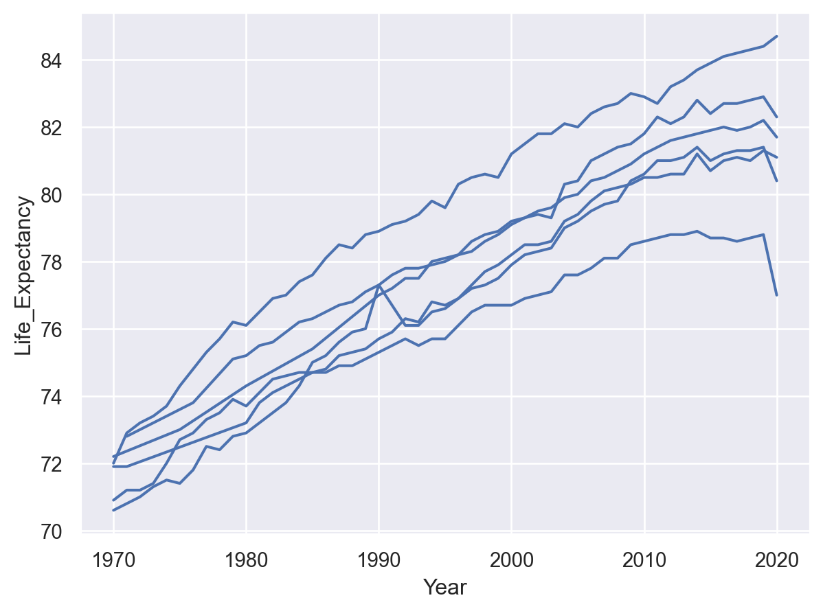
也可透過使用 group 程式碼來定義一個不變更任何視覺屬性的分組
(
    so.Plot(healthexp, x="Year", y="Life_Expectancy", group="Country")
    .add(so.Line())
)
繪圖前轉換資料#
統計轉換#
與許多 Seaborn 函數一樣,物件介面支援統計轉換。這些轉換乃由 Stat 物件執行,例如 Agg
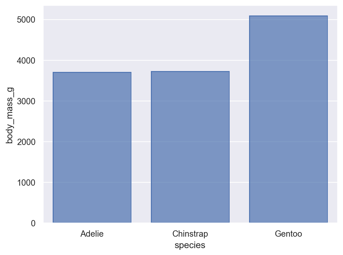
(
    so.Plot(penguins, x="species", y="body_mass_g")
    .add(so.Bar(), so.Agg())
)
在函數介面,一些視覺呈現(例如 seaborn.barplot())可使用統計轉換,但另一些則不可(例如 seaborn.scatterplot())。物件介面更乾脆地將呈現和轉換分離,讓你得以組成 Mark 和 Stat 物件
(
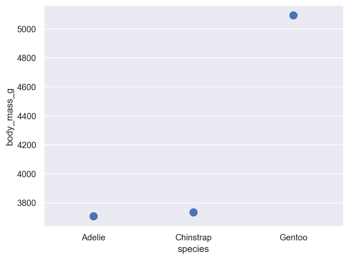
so.Plot(penguins, x="species", y="body_mass_g")
.add(so.Dot(pointsize=10), so.Agg())
)
在透過對應屬性形成群組時,Stat 轉換會個別套用於每個群組
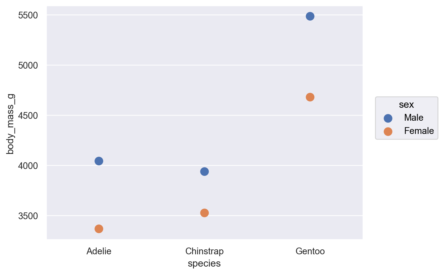
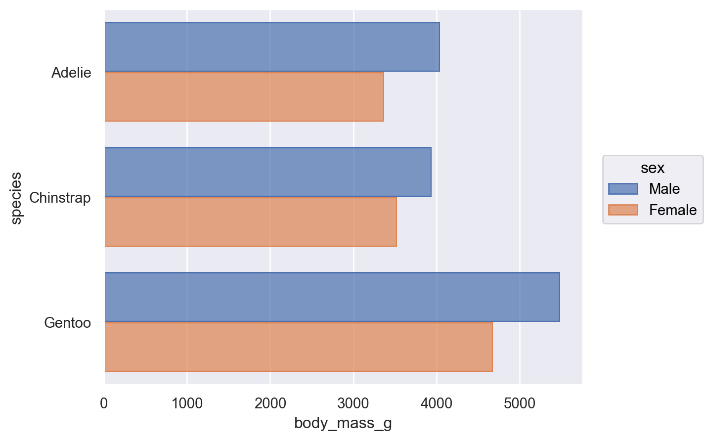
(
    so.Plot(penguins, x="species", y="body_mass_g", color="sex")
    .add(so.Dot(pointsize=10), so.Agg())
)
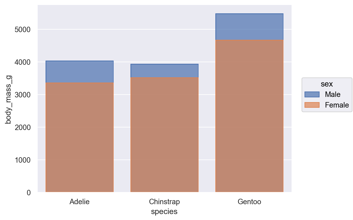
解決疊底問題#
有些 Seaborn 函數也具備自動解決疊底問題的機制,例如在 seaborn.barplot() 將「hue」分配後自動「跳動」長條圖。物件介面具有較不複雜的預設行為。預設情況下,代表多個群組的長條圖會重疊
(
    so.Plot(penguins, x="species", y="body_mass_g", color="sex")
    .add(so.Bar(), so.Agg())
)
儘管如此,也可將 Bar 標記與 Agg 統計和第二個由 Dodge 實作的轉換結合
(
    so.Plot(penguins, x="species", y="body_mass_g", color="sex")
    .add(so.Bar(), so.Agg(), so.Dodge())
)
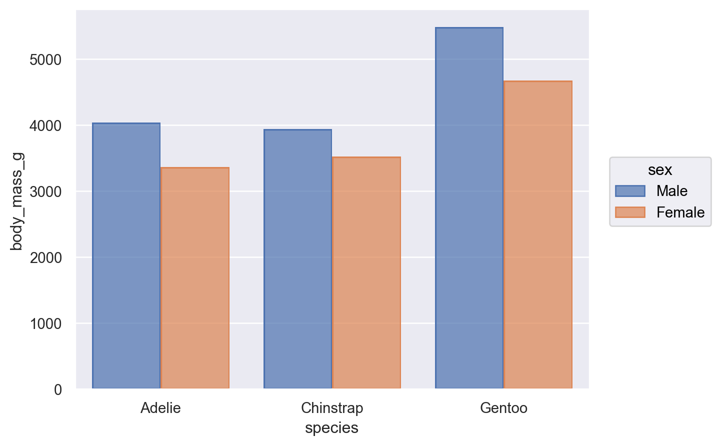
類別 Dodge 是 Move 變換的一個範例,這就像一個 Stat,但只會調整 x 和 y 座標。Move 類別可套用於任何標記,首先使用 Stat 並非必要
(
    so.Plot(penguins, x="species", y="body_mass_g", color="sex")
    .add(so.Dot(), so.Dodge())
)
也可以按順序套用多個 Move 作業
(
    so.Plot(penguins, x="species", y="body_mass_g", color="sex")
    .add(so.Dot(), so.Dodge(), so.Jitter(.3))
)
透過變換建立變數#
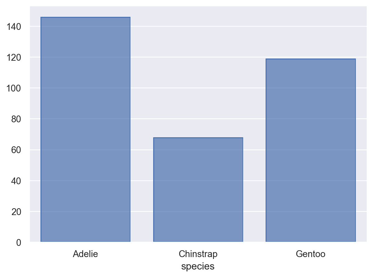
狀態 Agg 需要 x 和 y 都已經定義,但也可透過統計變換「建立」變數。例如,狀態 Hist 僅需要定義 x 或 y 其中一個,透過計算觀測數會建立另一個
(
    so.Plot(penguins, x="species")
    .add(so.Bar(), so.Hist())
)
狀態 Hist 也會建立新的 x 值(透過分組),當給予數字資料時
(
    so.Plot(penguins, x="flipper_length_mm")
    .add(so.Bars(), so.Hist())
)
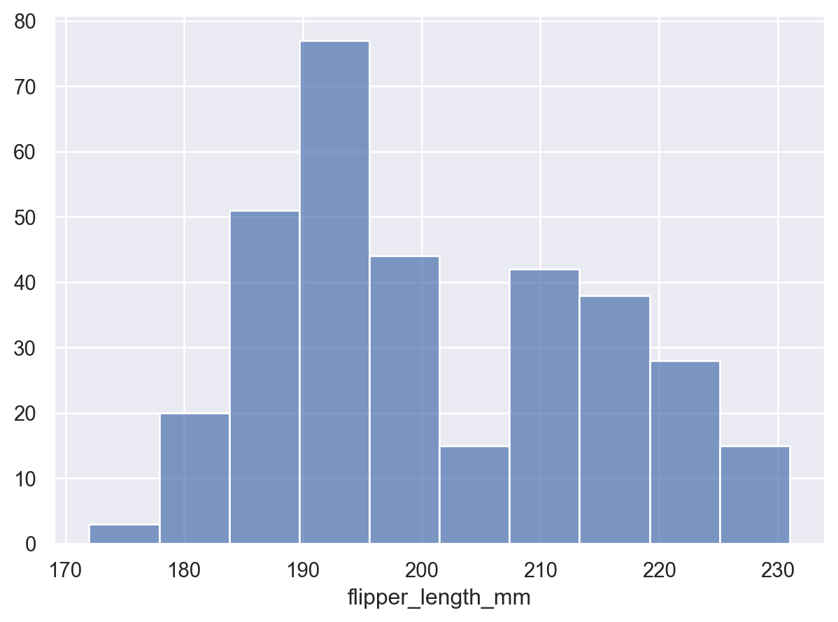
注意我們使用 Bars,而不是 Bar 來繪製具有連續 x 軸的圖形。這兩個標記相關,但 Bars 有不同的預設值,而且更適合連續的直方圖。它還產生不同的、更有效率的 matplotlib 藝術家。您會在其他地方找到單數/複數標記的模式。複數版本通常針對標記數目較多的情況進行最佳化。
有些轉換會接受 x 和 y,但會為每個坐標新增 區間 資料。這特別與在聚合後繪製誤差線有關
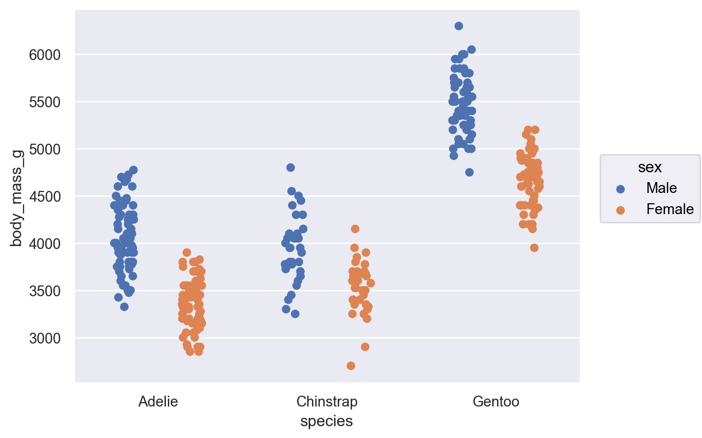
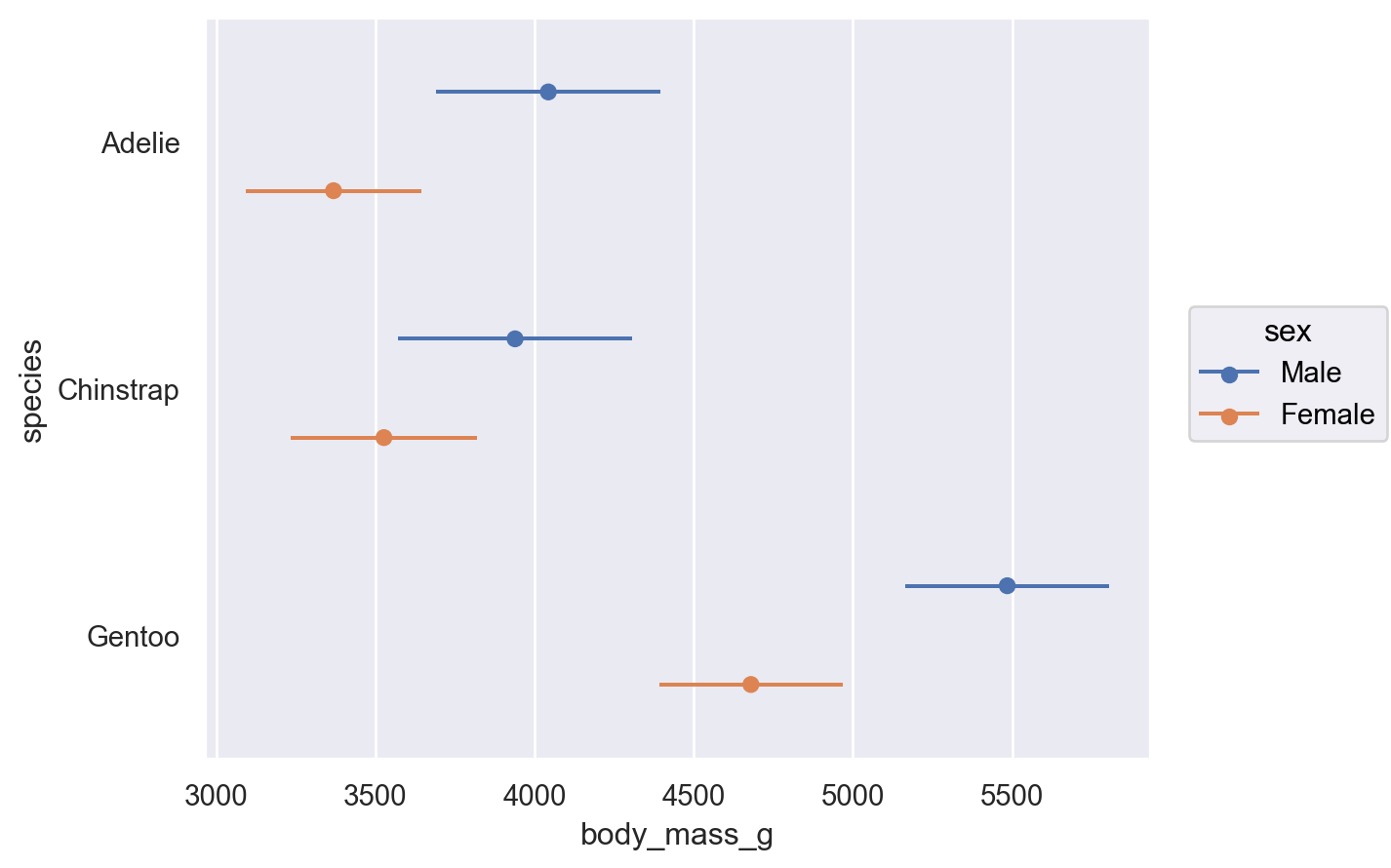
(
    so.Plot(penguins, x="body_mass_g", y="species", color="sex")
    .add(so.Range(), so.Est(errorbar="sd"), so.Dodge())
    .add(so.Dot(), so.Agg(), so.Dodge())
)
調整標記和轉換#
在聚合、逃避和繪製棒線時,會以不同的方式處理 x 和 y 變數。每個操作都有 方向 的概念。Plot 會試圖根據變數的資料類型自動判斷方向。例如,如果我們反轉 species 和 body_mass_g 的指定,我們會得到相同的圖形,但橫向展開
(
    so.Plot(penguins, x="body_mass_g", y="species", color="sex")
    .add(so.Bar(), so.Agg(), so.Dodge())
)
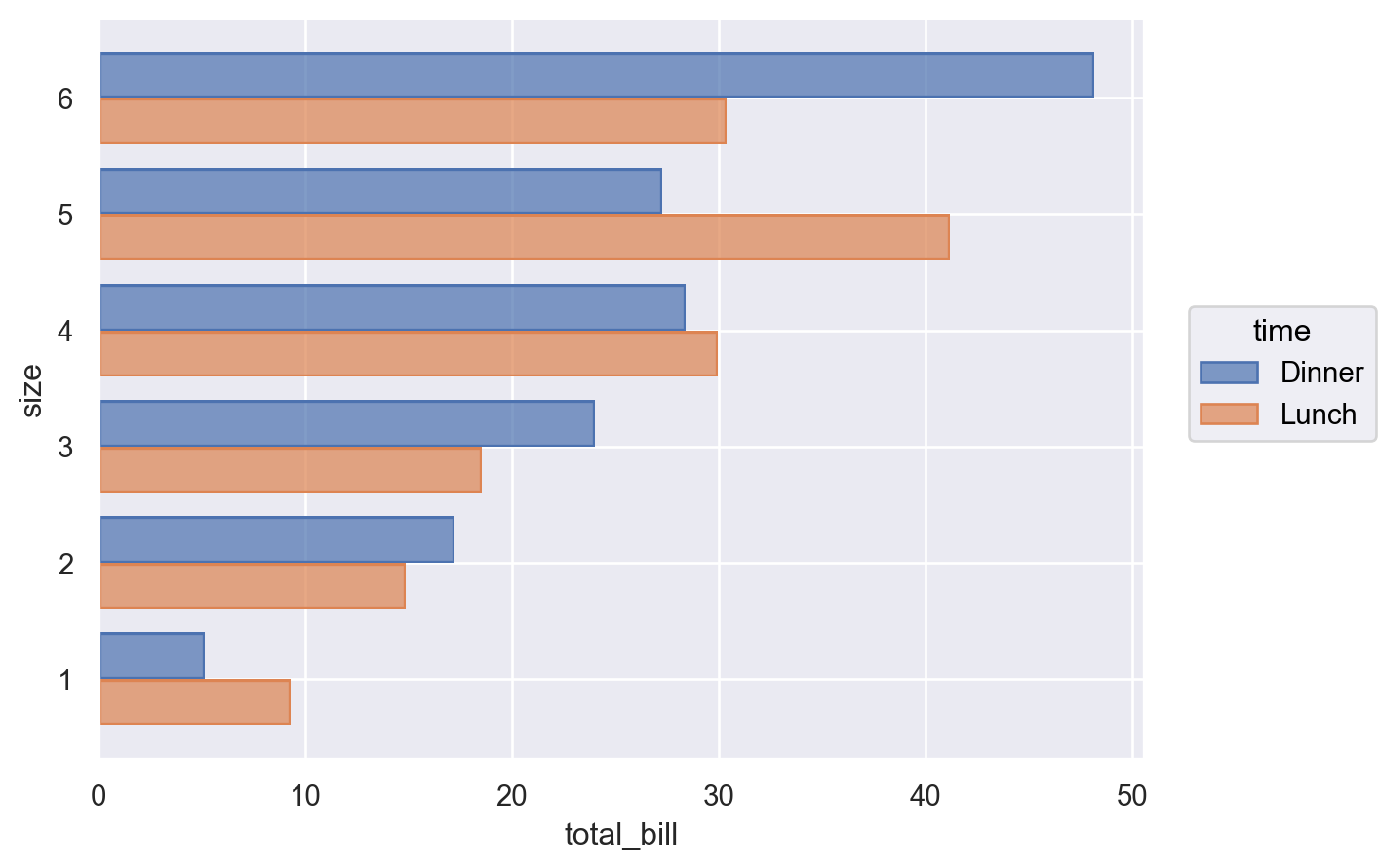
有時候,正確的方向很含糊,例如當 x 和 y 變數都是數字時。在這些情況下,您可以透過將 orient 參數傳遞給 Plot.add() 來明確說明
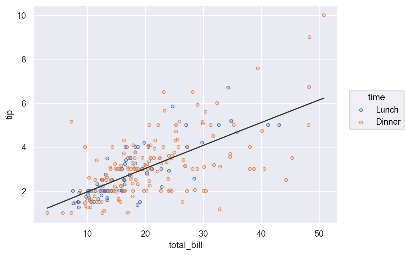
(
    so.Plot(tips, x="total_bill", y="size", color="time")
    .add(so.Bar(), so.Agg(), so.Dodge(), orient="y")
)
建立並顯示圖形#
到目前為止,大多數範例都只產生一個子圖形,且僅包含一種標記。但 Plot 沒有限制您這麼做。
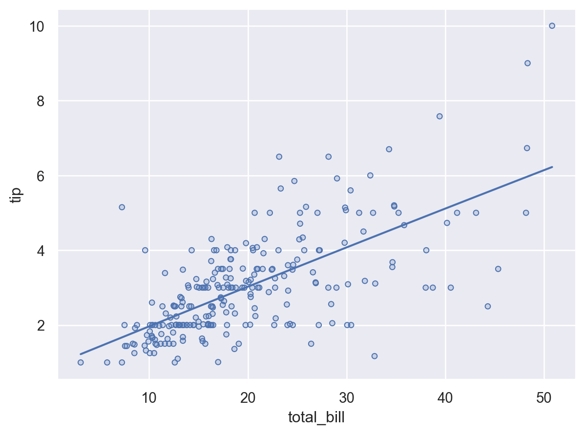
加入多個圖層#
更複雜的單一子區塊圖形可以透過重複呼叫 Plot.add() 來建立。每次呼叫時,它都會定義圖形中的圖層。例如,我們可能想加入一個散佈圖(現在使用 Dots),然後是一個迴歸擬合
(
    so.Plot(tips, x="total_bill", y="tip")
    .add(so.Dots())
    .add(so.Line(), so.PolyFit())
)
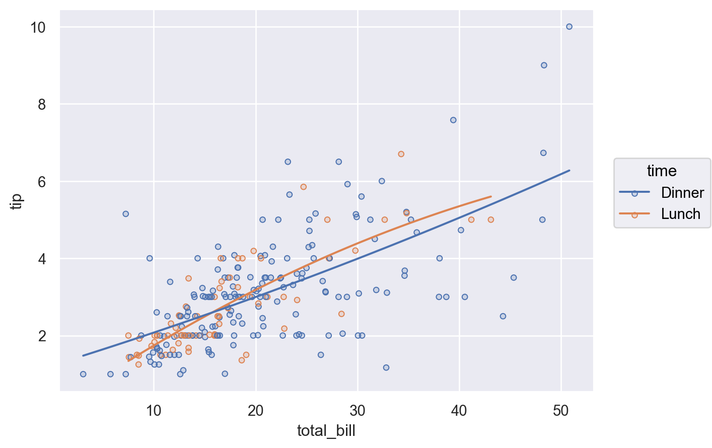
在 Plot 建構函式中定義的變數對應會用於所有圖層
(
    so.Plot(tips, x="total_bill", y="tip", color="time")
    .add(so.Dots())
    .add(so.Line(), so.PolyFit())
)
特定圖層的對應#
您也可以定義一個對應,讓它僅用於特定圖層中。這可藉由在對應圖層的 Plot.add 呼叫中定義對應來達成
(
    so.Plot(tips, x="total_bill", y="tip")
    .add(so.Dots(), color="time")
    .add(so.Line(color=".2"), so.PolyFit())
)
或者,定義整個圖形中的圖層,但是藉由將變數設為 None 來移除特定圖層
(
    so.Plot(tips, x="total_bill", y="tip", color="time")
    .add(so.Dots())
    .add(so.Line(color=".2"), so.PolyFit(), color=None)
)

綜上所述,有以下三種方法可以指定標記屬性的值:(1)在所有圖層中對應變數,(2)在特定圖層中對應變數,以及(3)直接設定屬性

分面和小圖形配對#
與 seaborn 的圖形層級函式(seaborn.displot()、seaborn.catplot() 等)一樣,Plot 介面也可以產生包含多個「分面」(facets)或包含資料子集的小圖形的圖形。這是透過 Plot.facet() 方法來完成的
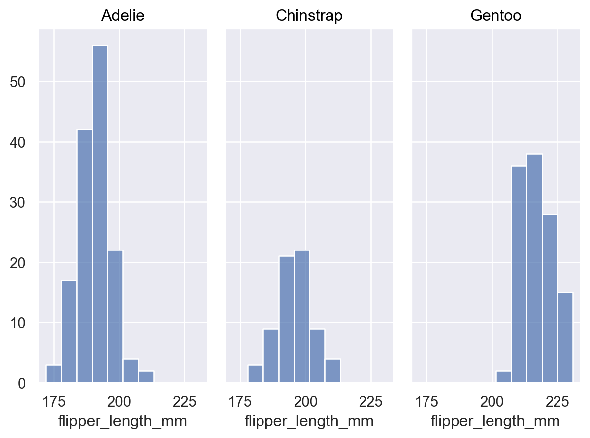
(
    so.Plot(penguins, x="flipper_length_mm")
    .facet("species")
    .add(so.Bars(), so.Hist())
)
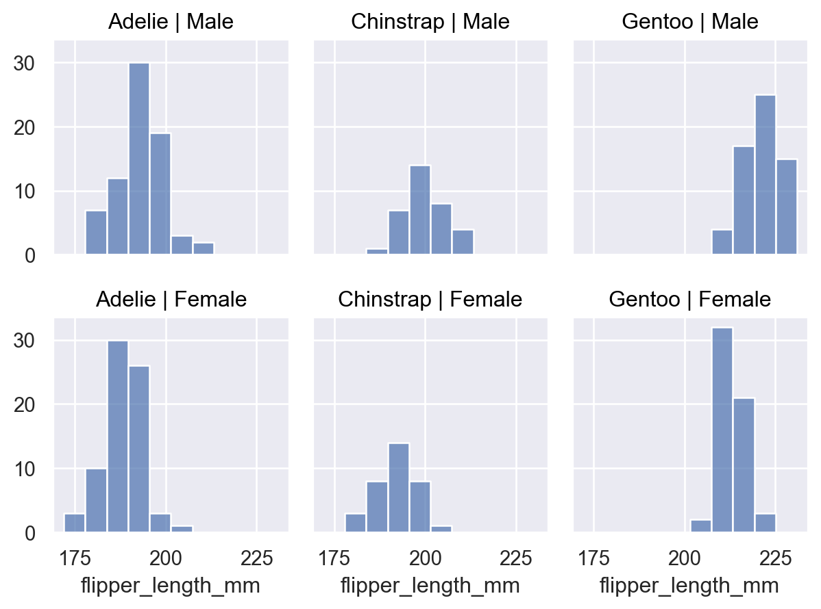
用應該用於定義圖形欄和列的變數呼叫 Plot.facet()
(
    so.Plot(penguins, x="flipper_length_mm")
    .facet(col="species", row="sex")
    .add(so.Bars(), so.Hist())
)
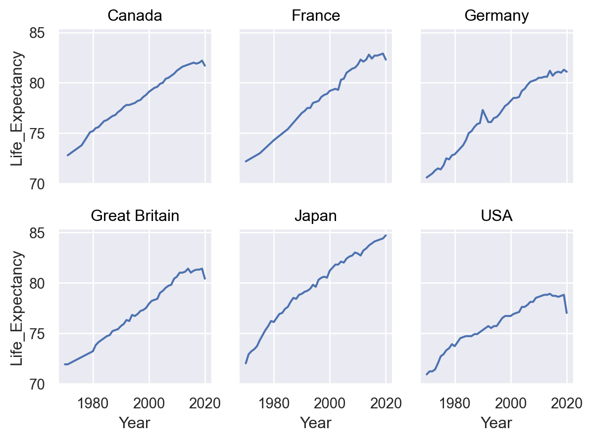
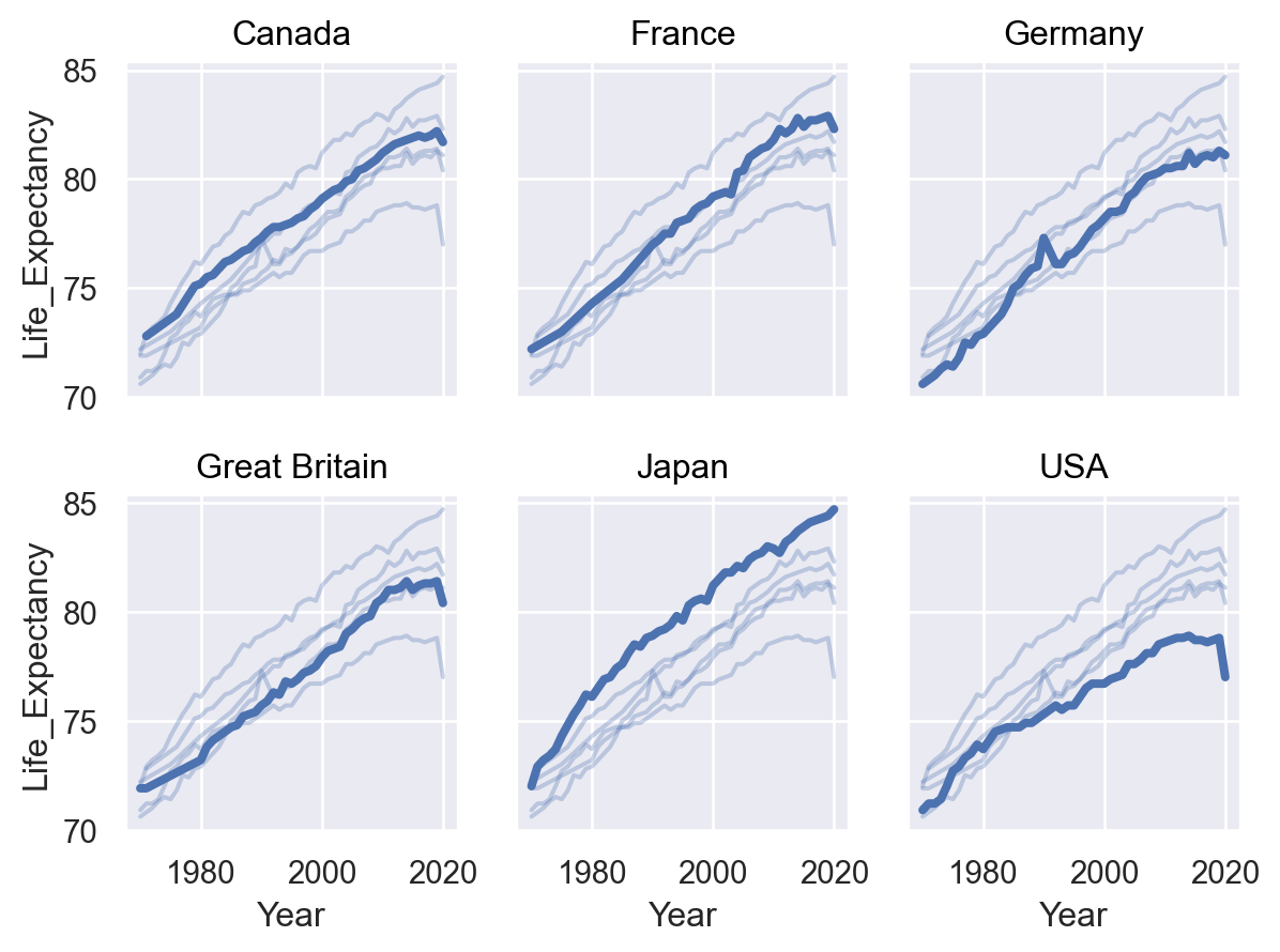
您可以透過「換行」橫跨另一個維度,以一個具有較多層級的變數為基礎進行分面
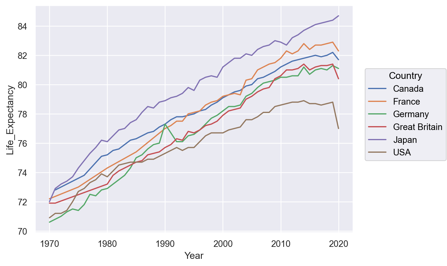
(
    so.Plot(healthexp, x="Year", y="Life_Expectancy")
    .facet(col="Country", wrap=3)
    .add(so.Line())
)
除非你明確排除所有圖層,否則所有圖層都將是分面的,這可用於在每個子圖上提供額外的內容
(
    so.Plot(healthexp, x="Year", y="Life_Expectancy")
    .facet("Country", wrap=3)
    .add(so.Line(alpha=.3), group="Country", col=None)
    .add(so.Line(linewidth=3))
)
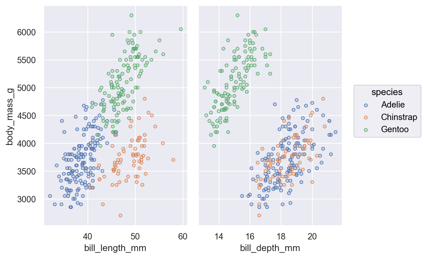
建立子圖的另一種方法是 Plot.pair()。就像 seaborn.PairGrid 一樣,這會將所有資料繪製在每個子圖上,使用不同的變數作為 x 和/或 y 座標
(
    so.Plot(penguins, y="body_mass_g", color="species")
    .pair(x=["bill_length_mm", "bill_depth_mm"])
    .add(so.Dots())
)
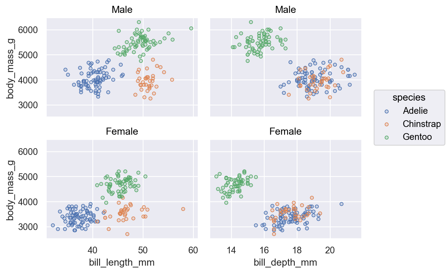
只要操作在相反的維度上新增子圖,你就可以結合分面和配對
(
    so.Plot(penguins, y="body_mass_g", color="species")
    .pair(x=["bill_length_mm", "bill_depth_mm"])
    .facet(row="sex")
    .add(so.Dots())
)
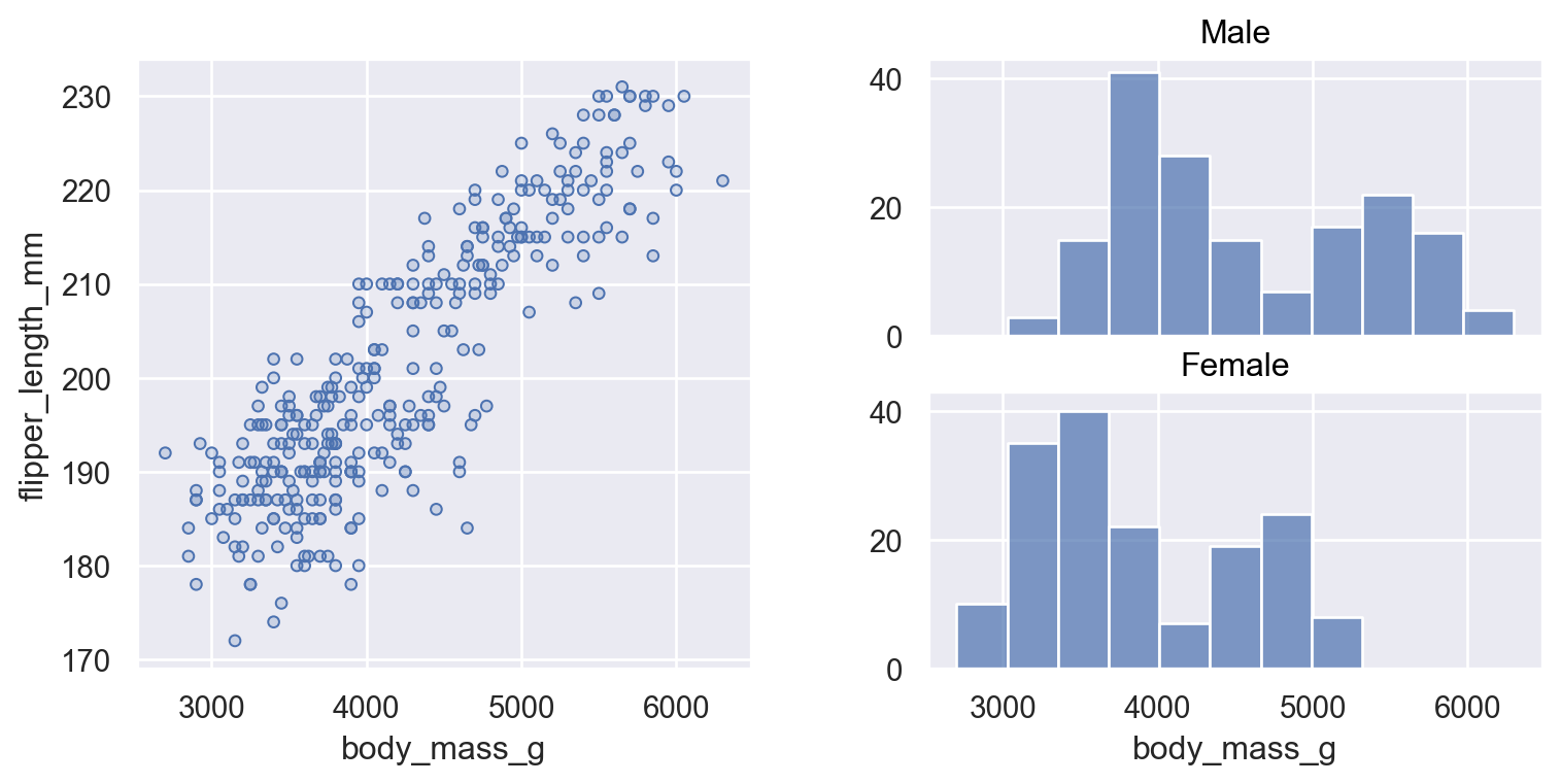
與 Matplotlib 整合#
有些情況下,你可能想要在比 Plot.facet() 或 Plot.pair() 能夠提供的更複雜結構的圖中顯示多個子圖。目前的解決方案是,將圖形設定委派給 Matplotlib,並提供 Plot 應使用 Plot.on() 方法使用的 Matplotlib 物件。此物件可以是 matplotlib.axes.Axes、matplotlib.figure.Figure 或 matplotlib.figure.SubFigure;後者對於建構客製化的子圖版面最為有用
f = mpl.figure.Figure(figsize=(8, 4))
sf1, sf2 = f.subfigures(1, 2)
(
    so.Plot(penguins, x="body_mass_g", y="flipper_length_mm")
    .add(so.Dots())
    .on(sf1)
    .plot()
)
(
    so.Plot(penguins, x="body_mass_g")
    .facet(row="sex")
    .add(so.Bars(), so.Hist())
    .on(sf2)
    .plot()
)
建立和顯示圖表#
需要知道的一件重要事情是,Plot 方法會複製呼叫它們的物件,並傳回該複製品,而不是更新該物件。這表示你可以定義一個共同的圖表規格,然後針對該規格產生多種變體。
因此,請採取這個基本規格
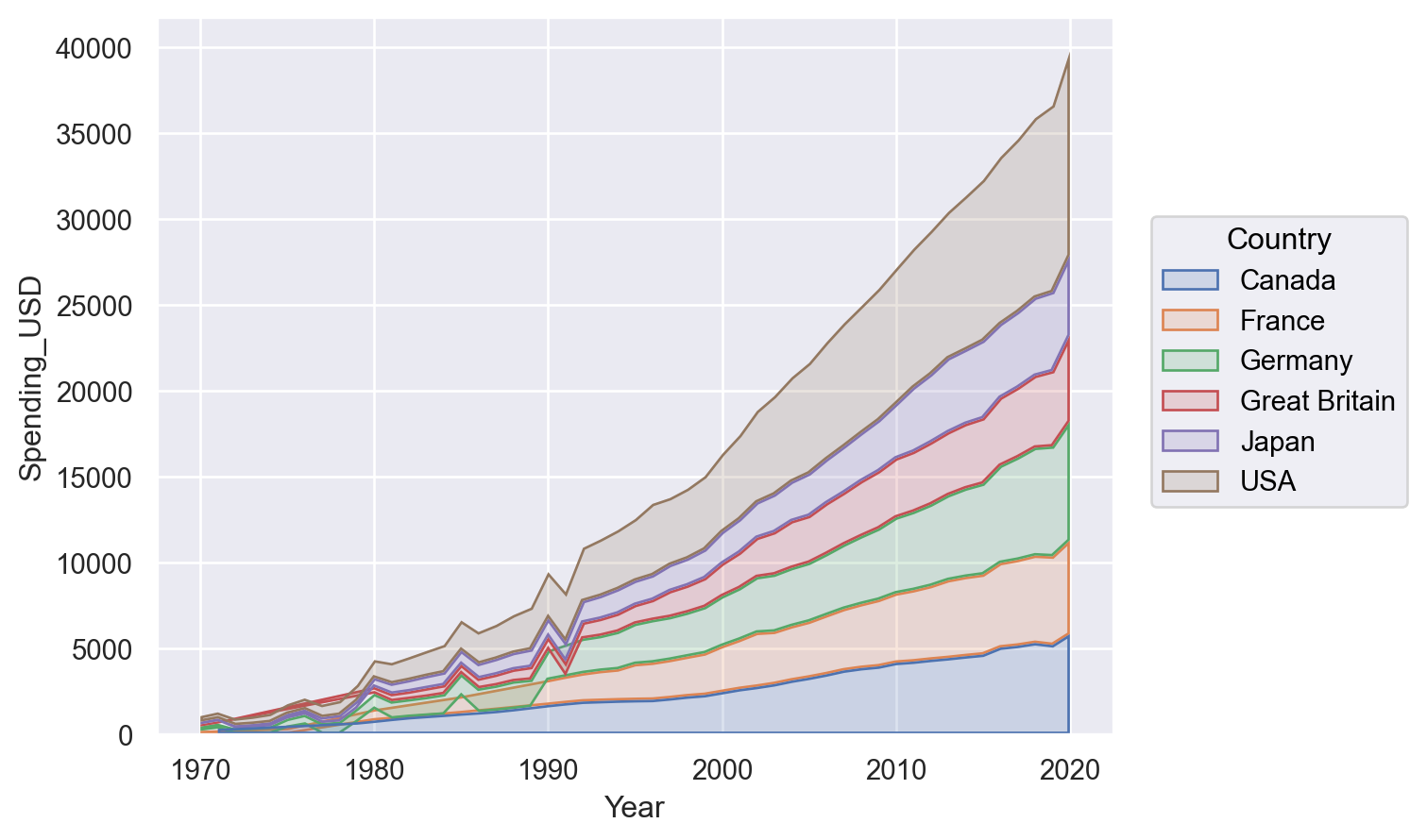
p = so.Plot(healthexp, "Year", "Spending_USD", color="Country")
我們可以使用它來繪製線條圖
p.add(so.Line())

或可能是堆疊的區域圖
p.add(so.Area(), so.Stack())
方法 Plot 完全具備聲明式特性。呼叫這些方法時會更新繪圖規格,但並不會實際執行任何繪製。此舉帶來的一個結果是方法可依任何順序呼叫,而其中許多方法甚至可多次呼叫。
繪圖實際上是在何時被渲染?Plot 經過最佳化,可於筆記本環境中使用。當 Plot 在 Jupyter REPL 中顯示時,會自動觸發渲染作業。這就是為什麼我們在上述定義 Plot 的範例中未看見任何內容,這是因為我們將 Plot 指定給 p,而不是讓它傳回 REPL。
若要於筆記本中看見繪圖,請從儲存格的最後一列傳回繪圖,或於物件中呼叫 Jupyter 內建的 display 函數。筆記本整合完全略過 matplotlib.pyplot,但您可以在其他脈絡中透過呼叫 Plot.show() 來使用 figure 顯示機制。
您也可以透過呼叫 Plot.save(),將繪圖儲存為檔案(或緩衝區)。
自訂外觀#
新介面旨在透過 Plot,支援大量自訂化功能,讓您無需轉換模式就能直接使用 matplotlib 功能。(但請耐心等待,畢竟尚非所有達成此目標所需的元素都已準備就緒!)
量表參數化#
所有數據相關屬性都由 Scale 概念和 Plot.scale() 方法控制。此方法接受多種不同類型的引數。其中一種可能性最接近於 matplotlib 中使用的比例,即傳遞函數名稱,讓函數能轉換座標
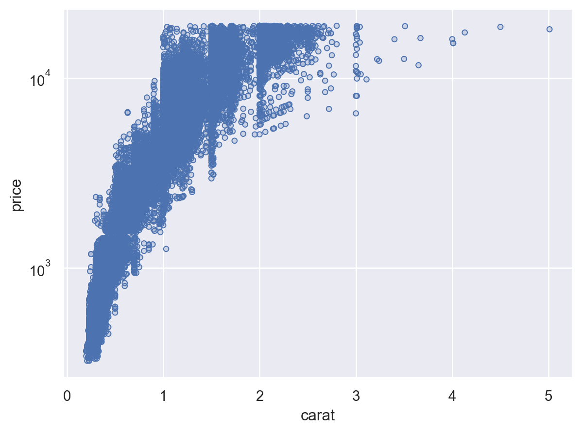
(
    so.Plot(diamonds, x="carat", y="price")
    .add(so.Dots())
    .scale(y="log")
)
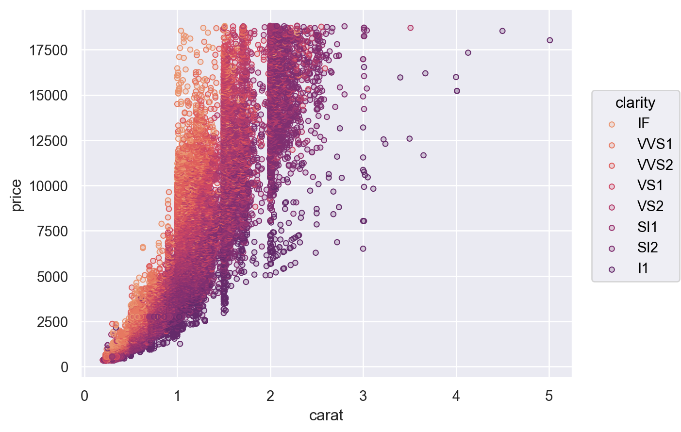
Plot.scale() 也可以控制語義屬性的對應,例如 color。您可以直接傳遞任何您希望傳遞給 seaborn 函數介面中 palette 參數的引數
(
    so.Plot(diamonds, x="carat", y="price", color="clarity")
    .add(so.Dots())
    .scale(color="flare")
)
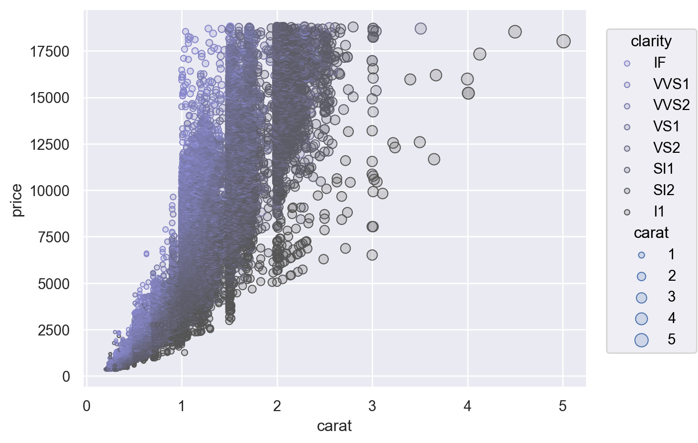
另一種選擇是提供一個 (min, max) 值的元組,控制比例應對應到的範圍。這適用於數值屬性和顏色
(
    so.Plot(diamonds, x="carat", y="price", color="clarity", pointsize="carat")
    .add(so.Dots())
    .scale(color=("#88c", "#555"), pointsize=(2, 10))
)
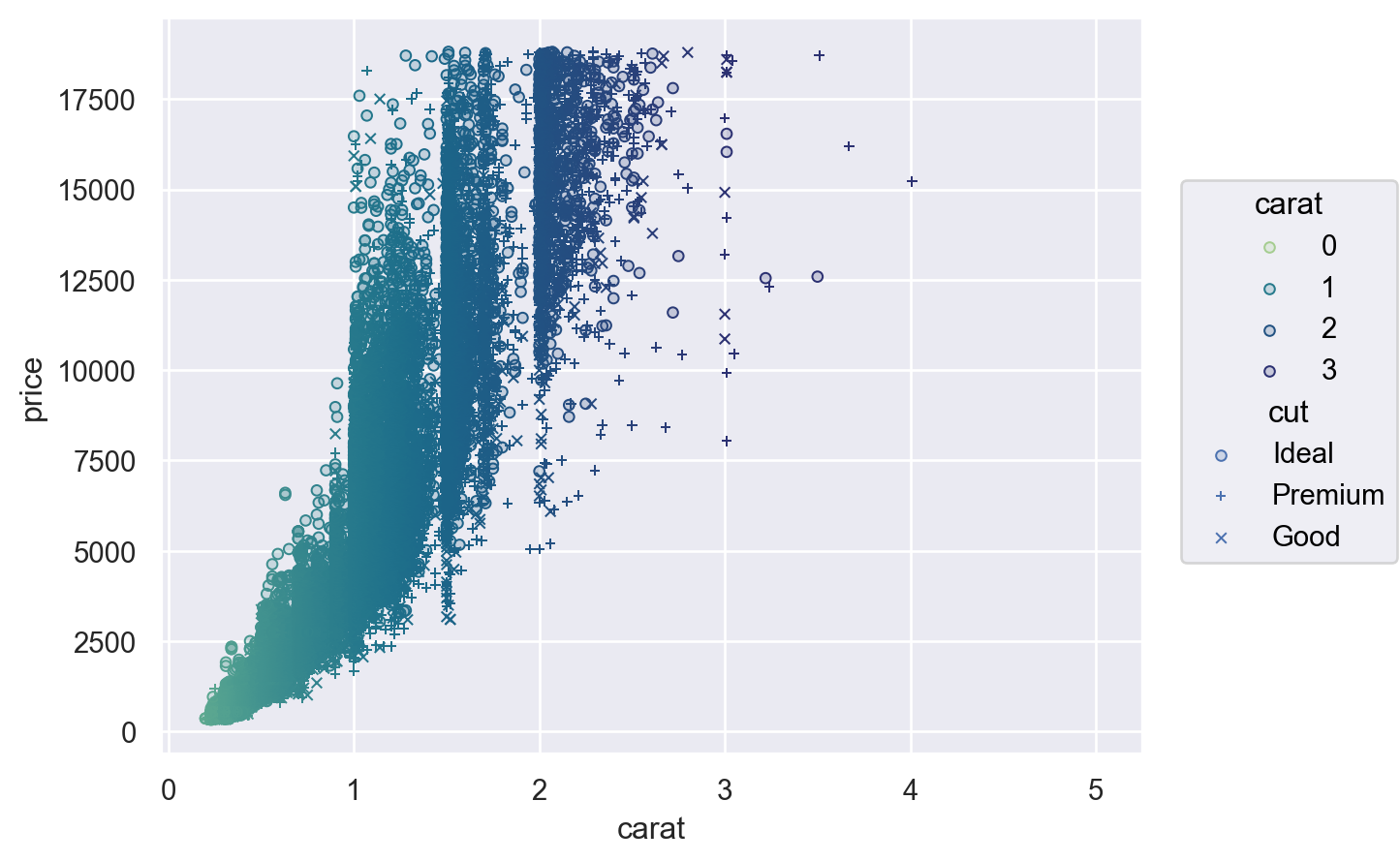
為了進一步控制,您可以傳遞一個 Scale 物件。有數種不同的 Scale 類型,每個類型都有適當的參數。例如,Continuous 讓您可以定義輸入網域 (norm),輸出範圍 (values) 和介於兩者之間對應的函數 (trans),而 Nominal 讓您可以指定排序
(
    so.Plot(diamonds, x="carat", y="price", color="carat", marker="cut")
    .add(so.Dots())
    .scale(
        color=so.Continuous("crest", norm=(0, 3), trans="sqrt"),
        marker=so.Nominal(["o", "+", "x"], order=["Ideal", "Premium", "Good"]),
    )
)
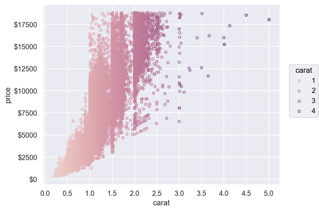
自訂圖例和刻度標籤#
物件 Scale 也是用來指定哪些數值應該顯示為軸刻度標籤/圖例中,以及顯示方式。例如,Continuous.tick() 方法能夠控制刻度的密度或位置,而 Continuous.label() 方法可修改格式
(
    so.Plot(diamonds, x="carat", y="price", color="carat")
    .add(so.Dots())
    .scale(
        x=so.Continuous().tick(every=0.5),
        y=so.Continuous().label(like="${x:.0f}"),
        color=so.Continuous().tick(at=[1, 2, 3, 4]),
    )
)
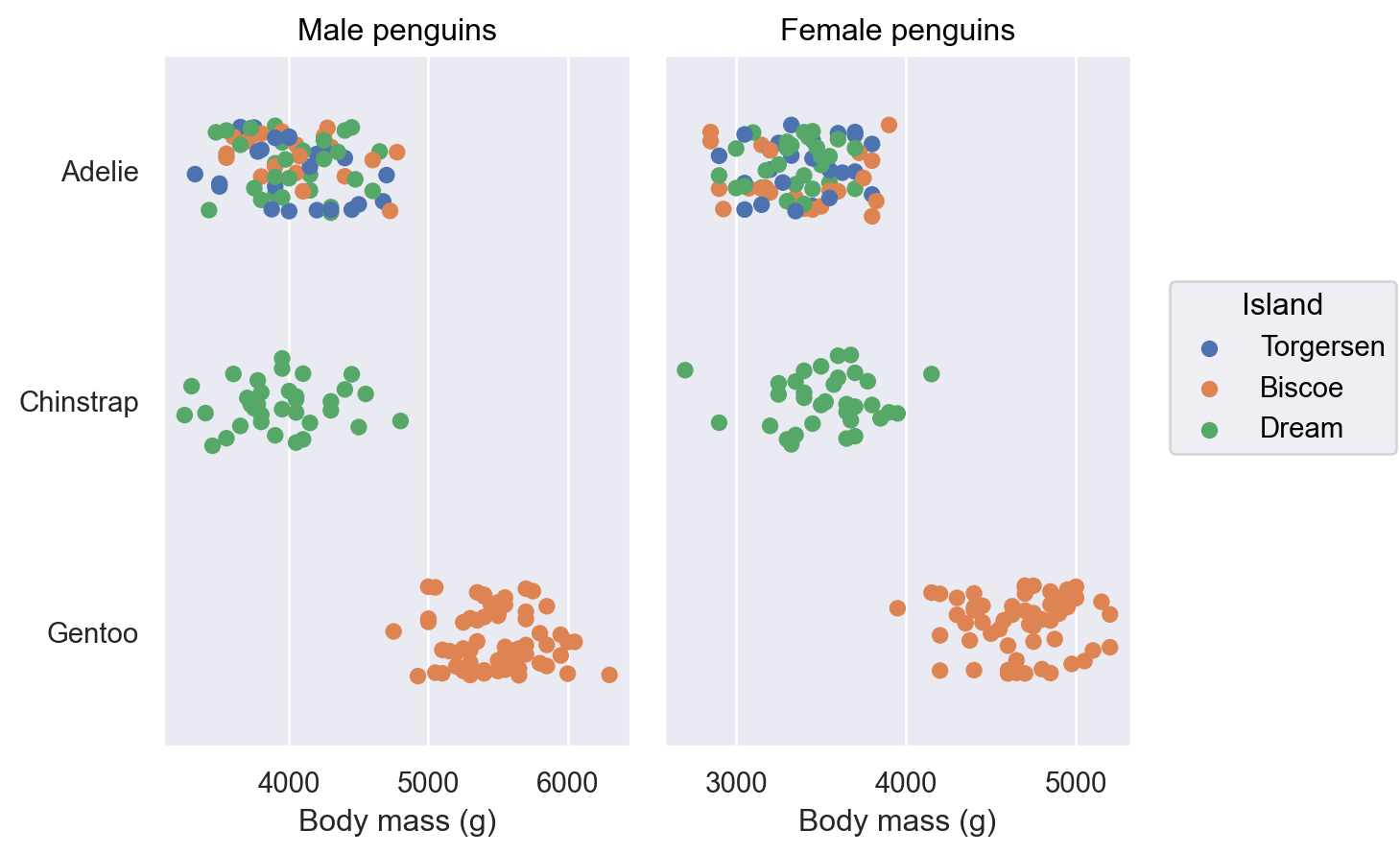
自訂限制、標籤和標題#
Plot 有許多方法可進行簡單自訂,包括 Plot.label()、Plot.limit() 和 Plot.share()
(
    so.Plot(penguins, x="body_mass_g", y="species", color="island")
    .facet(col="sex")
    .add(so.Dot(), so.Jitter(.5))
    .share(x=False)
    .limit(y=(2.5, -.5))
    .label(
        x="Body mass (g)", y="",
        color=str.capitalize,
        title="{} penguins".format,
    )
)
主題自訂#
最後,Plot 透過 Plot.theme 方法支援資料非相關的主題設定。目前,此方法接受 matplotlib rc 參數字典。你可以直接設定這些參數,或從 Seaborn 主題設定函式中傳遞參數套件
from seaborn import axes_style
theme_dict = {**axes_style("whitegrid"), "grid.linestyle": ":"}
so.Plot().theme(theme_dict)
若要變更所有 Plot 執行個體的主題,請更新 Plot.config
so.Plot.config.theme.update(theme_dict)