視覺化資料分佈#
在任何分析或建模資料的步驟中,第一步應該是要瞭解變數如何分佈。分佈視覺化技術可以快速回答許多重要的問題。觀測值涵蓋什麼範圍?它們的集中趨勢是什麼?它們是否嚴重偏向某一方向?是否有雙峰的跡象?是否有重要的離群值?這些問題的答案是否會因其他變數定義的子集而有所不同?
在 distributions 模組 中包含數項功能,旨在回答此類問題。軸層級函式為 histplot()、kdeplot()、ecdfplot() 和 rugplot()。它們在圖形層級的 displot()、jointplot() 和 pairplot() 函式中分組在一起。
有許多不同的方法可用來視覺化分佈,每種方法都有其相對優點和缺點。了解這些因素非常重要,這樣才能根據你的特定目標選擇最佳方法。
繪製單變數直方圖 #
視覺化分佈的常見方法可能是直方圖。這是 displot() 中的預設方法,它使用與 histplot() 相同的基礎程式碼。直方圖是條形圖,其中代表資料變數的軸被分成一組離散箱,且每一箱中觀察值的計數會以對應長條的高度顯示
penguins = sns.load_dataset("penguins")
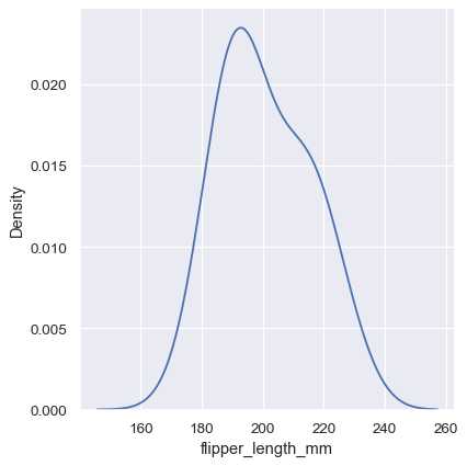
sns.displot(penguins, x="flipper_length_mm")
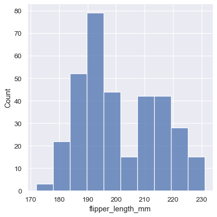
此圖表立即提供一些關於 flipper_length_mm 變數的見解。例如,我們可以看到最常見的鰭狀肢長度約為 195 mm,但分佈看起來是雙峰的,因此這個數字並不能很好地表示資料。
選擇箱寬 #
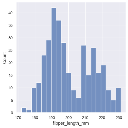
區間大小是重要參數,而區間大小錯誤會掩蓋資料的重要特徵,或從隨機變異性中建立顯著的特徵,進而造成誤導。預設值為 displot()/histplot() 會根據資料變異數和觀測數量,選擇預設區間大小。不過你不能過度依賴這些自動做法,因為它們依賴資料結構的特定假設。務必確認你對區間的印象,與不同區間大小一致。若要直接選擇大小,請設定 binwidth 參數
sns.displot(penguins, x="flipper_length_mm", binwidth=3)

在其他情況下,可能會更希望能指定區間的數量,而不是大小
sns.displot(penguins, x="flipper_length_mm", bins=20)
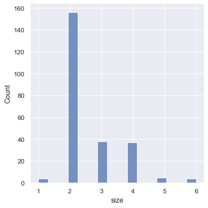
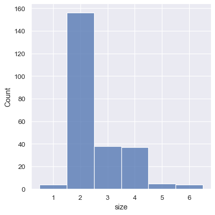
預設發生錯誤的一種情況範例,是變異數具有相對較少的整數值時。在這種情況下,區間預設寬度可能會過窄,造成區間分佈中出現難看的間隙
tips = sns.load_dataset("tips")
sns.displot(tips, x="size")
一種做法是透過將陣列傳遞給 bins 來指定區間中斷點
sns.displot(tips, x="size", bins=[1, 2, 3, 4, 5, 6, 7])

也可以透過設定 discrete=True 來達成這個目標,它會選擇中斷點來表示資料集中對應值為長條中心點的唯一值。
sns.displot(tips, x="size", discrete=True)
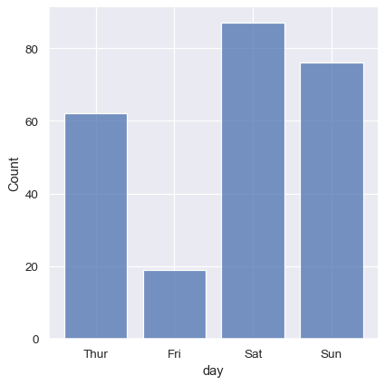
也可以使用直方圖的邏輯來視覺化類變異數分佈。對類變異數自動設定間斷的區間,但也可以稍微「縮小」長條,以強調軸的類別性質
sns.displot(tips, x="day", shrink=.8)
條件其他變異數#
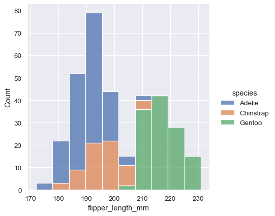
在了解變異數分佈後,下一步通常是詢問資料集中其他變異數的分布特徵是否有差異。例如,我們上面看到的鰭狀肢長度為何會呈現雙峰分布? displot() 和 histplot() 提供透過 hue 語意值支援條件子設定。將變異數指定給 hue 會根據每個唯一值繪製個別直方圖,並以顏色加以區別
sns.displot(penguins, x="flipper_length_mm", hue="species")
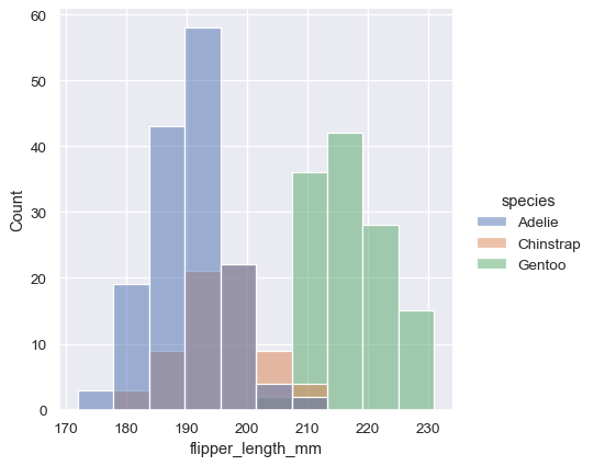
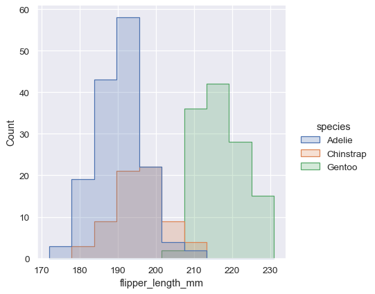
在預設值下,不同的直方圖是「分層」的,並且在某些狀況下它們可能會很難辨別。一種解決辦法是將直方圖的可視化表示法從長條圖改成「階梯」圖形
sns.displot(penguins, x="flipper_length_mm", hue="species", element="step")
或者,除了依序疊加每個長條,也可以將它們「堆疊」起來,也就是垂直移動。在這種圖形裡,完整直方圖的輪廓會和只單一變數的圖形相符
sns.displot(penguins, x="flipper_length_mm", hue="species", multiple="stack")
堆疊直方圖強調變數之間的部分-整體關係,但它可能會遮住其他特徵(例如,很難決定阿德利企鵝分佈的模式。另一個解決辦法是「閃避」長條,這表示將它們水平移動並縮減寬度。這能確保這些長條不會重疊,而且在高度方面仍然可供比較。但這只有在分類變數具備少數幾個層級時才有用
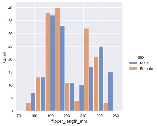
sns.displot(penguins, x="flipper_length_mm", hue="sex", multiple="dodge")
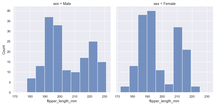
由於 displot() 是個圖表層級函數且會繪製到FacetGrid 上,所以也可以將每個個別分佈繪製在一個個別子區塊中,方法是將第二個變數指定給col 或 row,而不是指定(或另外指定) hue。這能妥善地表示每個子集的分佈,但會讓直接比較變得更困難
sns.displot(penguins, x="flipper_length_mm", col="sex")
這些做法都不是完美的,我們很快就會看到一些更適合用於比較任務的直方圖替代方案。
正規化直方圖統計資料#
在我們介紹替代方案之前,要注意的另一點是,當子集擁有不均勻的觀測數量時,比較其在計算中的分佈可能不是理想的做法。一個解決方案是透過stat 參數來正規化計算
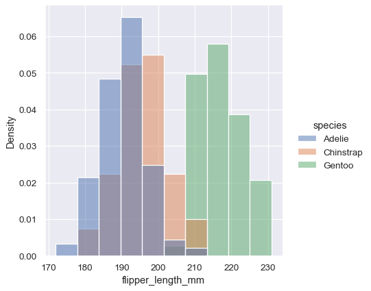
sns.displot(penguins, x="flipper_length_mm", hue="species", stat="density")
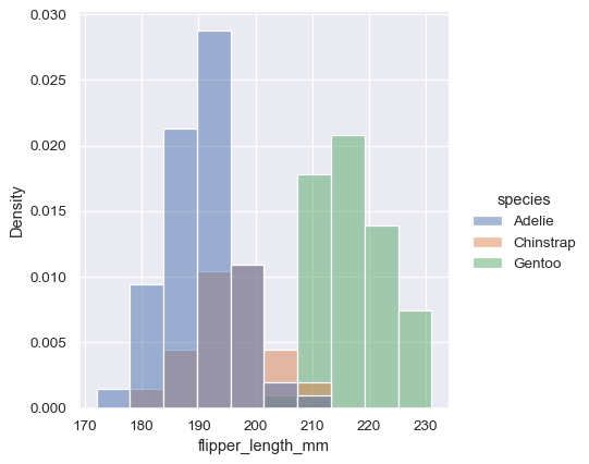
然而,在預設值下,正規化會套用至整個分佈,所以這僅僅是重新調整長條的高度。透過設定 common_norm=False,每個子集都將獨立地正規化
sns.displot(penguins, x="flipper_length_mm", hue="species", stat="density", common_norm=False)
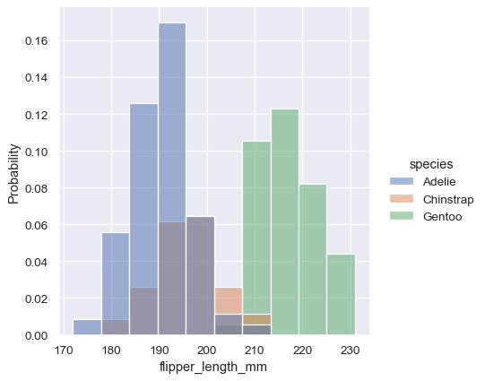
密度正規化會調整長條,使其面積總和為 1。因此,密度軸並非可直接解釋的。另一個選項是將長條正規化,使其高度總和為 1。當變數是離散的時,這樣的作法最有意義,但這是所有直方圖都適用的選項
sns.displot(penguins, x="flipper_length_mm", hue="species", stat="probability")
核密度估計#
直方圖的目的是透過分類觀察結果並進行統計,來近似產生資料的底層機率密度函數。核密度估計 (KDE) 提供了一個不同的解決方案來解決相同的問題。KDE 繪製圖形並非使用離散的分類箱,而是使用高斯核對觀察結果進行平滑處理,並產生連續的密度估計
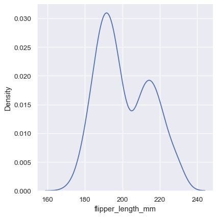
sns.displot(penguins, x="flipper_length_mm", kind="kde")
選擇平滑頻寬#
與直方圖中的分類箱大小非常類似,KDE 精確表示資料的能力取決於平滑頻寬的選擇。過度平滑的估計可能會消除有意義的特徵,但平滑不足的估計可能會使隨機雜訊中的真實形狀看不清楚。檢查估計是否穩健最簡單的方法是調整預設的頻寬
sns.displot(penguins, x="flipper_length_mm", kind="kde", bw_adjust=.25)
請注意窄頻寬會讓雙峰顯得更加明顯,但是曲線會變得不那麼平滑。相反地,較大的頻寬會幾乎完全遮住雙峰
sns.displot(penguins, x="flipper_length_mm", kind="kde", bw_adjust=2)
以其他變數為條件#
與直方圖相同,如果您指定了 hue 變數,系統會針對該變數的每個層級計算密度估計
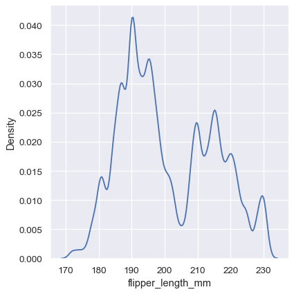
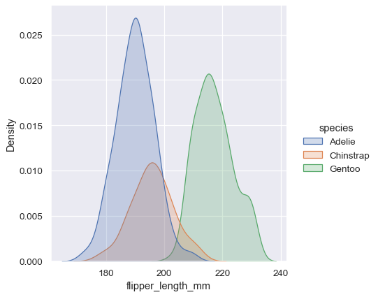
sns.displot(penguins, x="flipper_length_mm", hue="species", kind="kde")
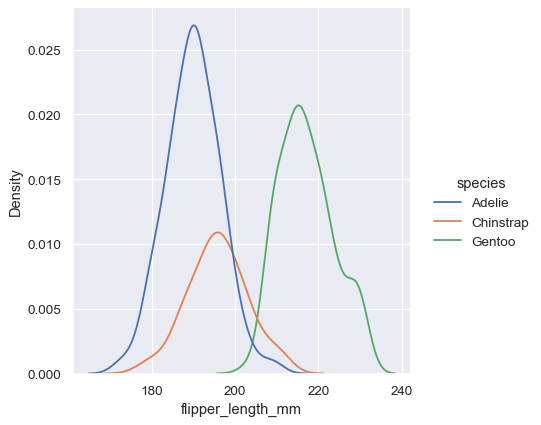
在許多情況下,分層的 KDE 比分層的直方圖更容易解讀,因此這通常是進行比較作業的良好選擇。不過,許多用於解決多個分配的相同選項也適用於 KDE
sns.displot(penguins, x="flipper_length_mm", hue="species", kind="kde", multiple="stack")
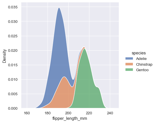
請注意,堆疊繪製圖形預設會填滿每個曲線之間的區域。而且也可以填滿單一或分層密度的曲線,不過預設的 alpha 值(不透明度)會不同,以便更輕鬆地辨識個別密度。
sns.displot(penguins, x="flipper_length_mm", hue="species", kind="kde", fill=True)
核密度估計的陷阱#
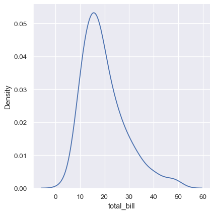
KDE 繪製圖形有許多優點。資料的重要特徵很容易辨識(集中趨勢、雙峰、偏度),而且可以輕易比較子集。不過,在某些情況下,KDE 並無法很好地表示底層資料。這是因為 KDE 的邏輯假設底層分配是平滑且無界限的。造成此假設失敗的一個方法是,當一個變數反映出自然受到界限約束的數量。如果有些觀察值接近界限(例如,無法為負數的變數的數值很小),KDE 曲線可能會延伸到不切實際的數值
sns.displot(tips, x="total_bill", kind="kde")
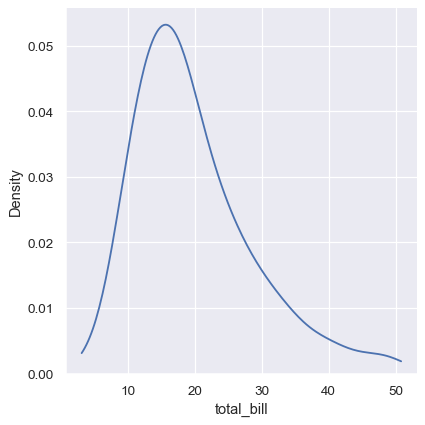
指定曲線應延伸到極端資料點後方的幅度時,可以透過 cut 參數來避免這種問題。不過,這只會影響曲線的繪製位置,密度估計仍會平滑資料不存在的範圍,導致其在分配曲線的極端值處過低
sns.displot(tips, x="total_bill", kind="kde", cut=0)
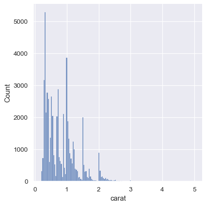
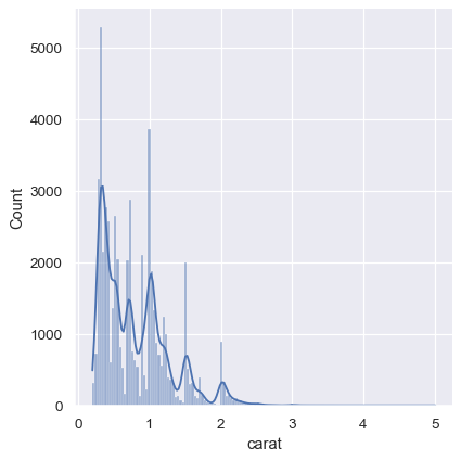
KDE 方法對於離散資料或資料本身為連續分布,但特定數值有過度呈現時,也會失靈。要注意的是,即使資料本身不平滑,KDE 永遠會顯示平滑曲線。例如,考量這個鑽石重量的散佈圖
diamonds = sns.load_dataset("diamonds")
sns.displot(diamonds, x="carat", kind="kde")
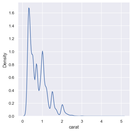
雖然 KDE 會暗示特定數值附近有尖端,但直方圖顯示的是更不平順的散佈
sns.displot(diamonds, x="carat")
折衷做法是將這兩種方法結合起來。在直方圖模式中,displot()(和 histplot() 一樣)有選項將平滑 KDE 曲線包含在內(請注意,是 kde=True,不是 kind="kde")
sns.displot(diamonds, x="carat", kde=True)
經驗累積分佈#
視覺化分布的第三個選項是計算「經驗累計分布函數」(ECDF)。這個繪圖方式會在各個數據點繪製一個單調遞增的曲線,曲線高度反映的值小於此值的觀察比例
sns.displot(penguins, x="flipper_length_mm", kind="ecdf")
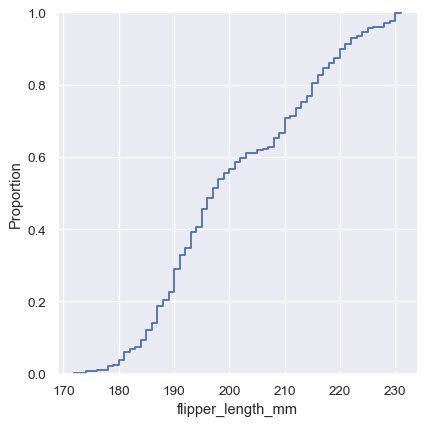
ECDF 繪圖有兩個關鍵優點。和直方圖或 KDE 不一樣,它直接呈現各個數據點。表示沒有箱寬或平滑參數要考慮。此外,由於曲線是單調遞增的,非常適合用來比較多個分布
sns.displot(penguins, x="flipper_length_mm", hue="species", kind="ecdf")
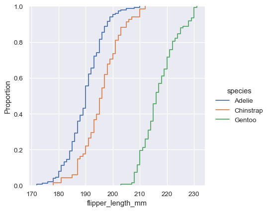
ECDF 繪圖的主要缺點是,它沒有直方圖或密度曲線那麼直覺地呈現分布形狀。想一想,直方圖可以立刻看出鰭腳長度的雙峰分布特性,但要在 ECDF 中看出這點,必須仔細觀察各個斜率。雖然如此,熟能生巧,你可以學習透過檢查 ECDF 來回答與分布有關的所有重要問題,這會是很強大的方法。
視覺化二變量分布#
到目前為止的所有範例都考量了一變量分布:單一變量的分布,或許條件取決於指定的第二個變量,並賦予 hue。不過,將第二個變量指定給 y 會繪製二變量分布
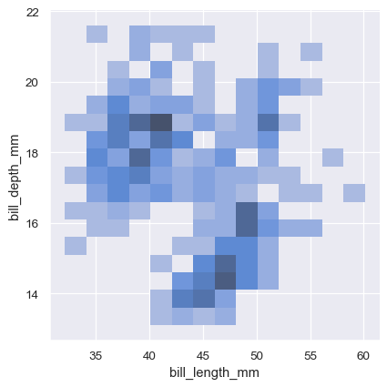
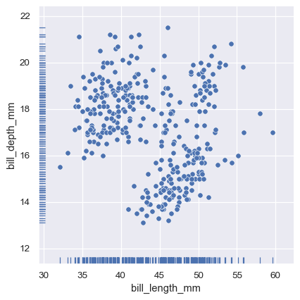
sns.displot(penguins, x="bill_length_mm", y="bill_depth_mm")
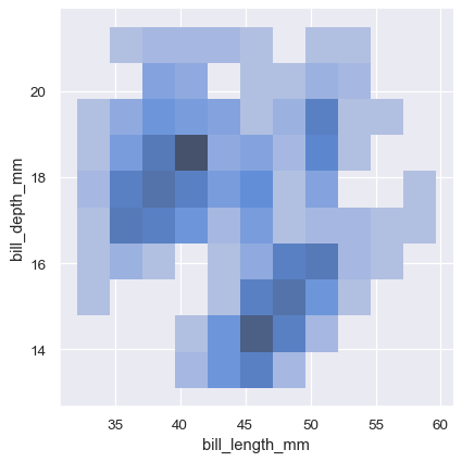
雙變數直方圖將區塊內資料彙整起來形成長方形,然後顯示每個長方形內觀測資料的次數,並以填充顏色(類似於 heatmap())表示。類似地,雙變數 KDE 圖會使用 2D 高斯函數將 (x, y) 觀測資料平滑化。然後,預設表示法會顯示 2D 密度函數的等值線
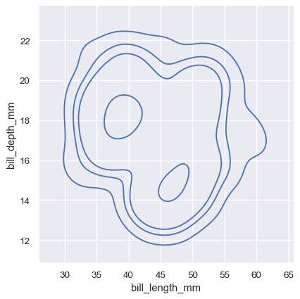
sns.displot(penguins, x="bill_length_mm", y="bill_depth_mm", kind="kde")
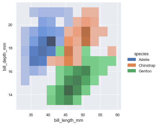
指定 hue 變數會使用不同的顏色繪製多個熱圖或等值線集合。對於雙變數直方圖,只有條件機率分佈間重疊情形最少的情況下,才能發揮良好的效果
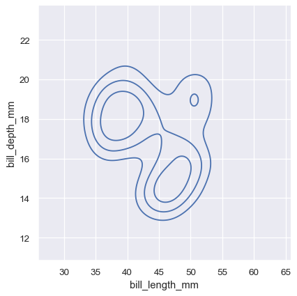
sns.displot(penguins, x="bill_length_mm", y="bill_depth_mm", hue="species")
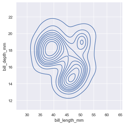
雙變數 KDE 圖的等值線方法更適合作為評量重疊情形,儘管等值線過多的圖表可能雜亂
sns.displot(penguins, x="bill_length_mm", y="bill_depth_mm", hue="species", kind="kde")

就像單變數圖一樣,區塊大小或平滑頻寬的選擇,將決定圖表能多好地代表底層雙變數機率分佈。同樣的參數適用,但透過傳遞一組數值,可以針對每個變數進行調整
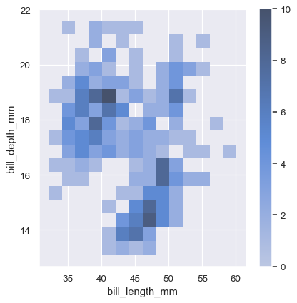
sns.displot(penguins, x="bill_length_mm", y="bill_depth_mm", binwidth=(2, .5))
為幫助解讀熱圖,請加上色彩條,以顯示次數與顏色強度之間的對應關係
sns.displot(penguins, x="bill_length_mm", y="bill_depth_mm", binwidth=(2, .5), cbar=True)
雙變數密度等值線的意義較不明確。因為密度無法直接解讀,所以等值線會繪製在密度的等比例上,表示每個曲線都顯示一個階層集合,而密度函數中的部分比例 p 都位於它下方。p 值均勻分佈,最低層級由 thresh 參數控制,而數目則由 levels 控制
sns.displot(penguins, x="bill_length_mm", y="bill_depth_mm", kind="kde", thresh=.2, levels=4)
若要取得更多控制權,levels 參數也可以接受一個值清單
sns.displot(penguins, x="bill_length_mm", y="bill_depth_mm", kind="kde", levels=[.01, .05, .1, .8])
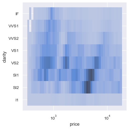
雙變數直方圖允許其中一個或兩個變數是離散的。繪製一個離散變數和一個連續變數,提供了另外一種方法來比較條件單變數機率分佈
sns.displot(diamonds, x="price", y="clarity", log_scale=(True, False))
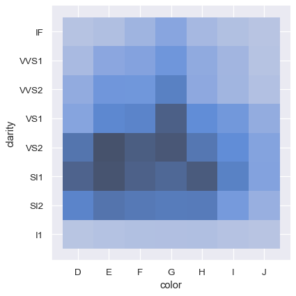
相反地,繪製兩個離散變數是一個容易的方式,用以顯示觀測資料的交互列聯表
sns.displot(diamonds, x="color", y="clarity")
其他場合的機率分佈視覺化#
Seaborn 中的其他幾個圖形層級繪圖函數使用了 histplot() 和 kdeplot() 函數。
繪製聯合機率分佈和邊際機率分佈#
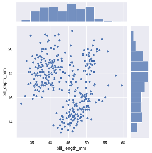
第一個是 jointplot(),它以兩變量的邊際分布擴充了雙變量關係或分布圖形。預設值下,jointplot() 使用 scatterplot() 表示雙變量分布,並使用 histplot() 表示邊際分布
sns.jointplot(data=penguins, x="bill_length_mm", y="bill_depth_mm")
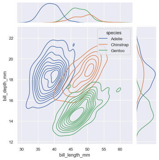
類似於 displot(),在 jointplot() 中設定另一個 kind="kde" 會改變聯合和邊際圖形,並使用 kdeplot()
sns.jointplot(
    data=penguins,
    x="bill_length_mm", y="bill_depth_mm", hue="species",
    kind="kde"
)
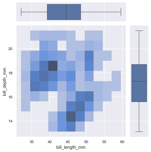
jointplot() 是 JointGrid 類別的延伸,直接使用時能提供更大的彈性
g = sns.JointGrid(data=penguins, x="bill_length_mm", y="bill_depth_mm")
g.plot_joint(sns.histplot)
g.plot_marginals(sns.boxplot)
一個較不顯眼的邊際分佈顯示方式是使用「地毯」圖,這會在圖表的邊緣增加一個小刻痕,用來表示每個個別觀察值。此功能已內建於 displot()
sns.displot(
    penguins, x="bill_length_mm", y="bill_depth_mm",
    kind="kde", rug=True
)
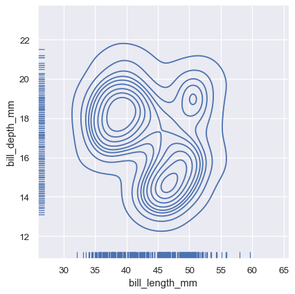
並且可以透過軸層級的 rugplot() 函數,在任何其他類型的圖形中加入「地毯」
sns.relplot(data=penguins, x="bill_length_mm", y="bill_depth_mm")
sns.rugplot(data=penguins, x="bill_length_mm", y="bill_depth_mm")
繪製多個分布#
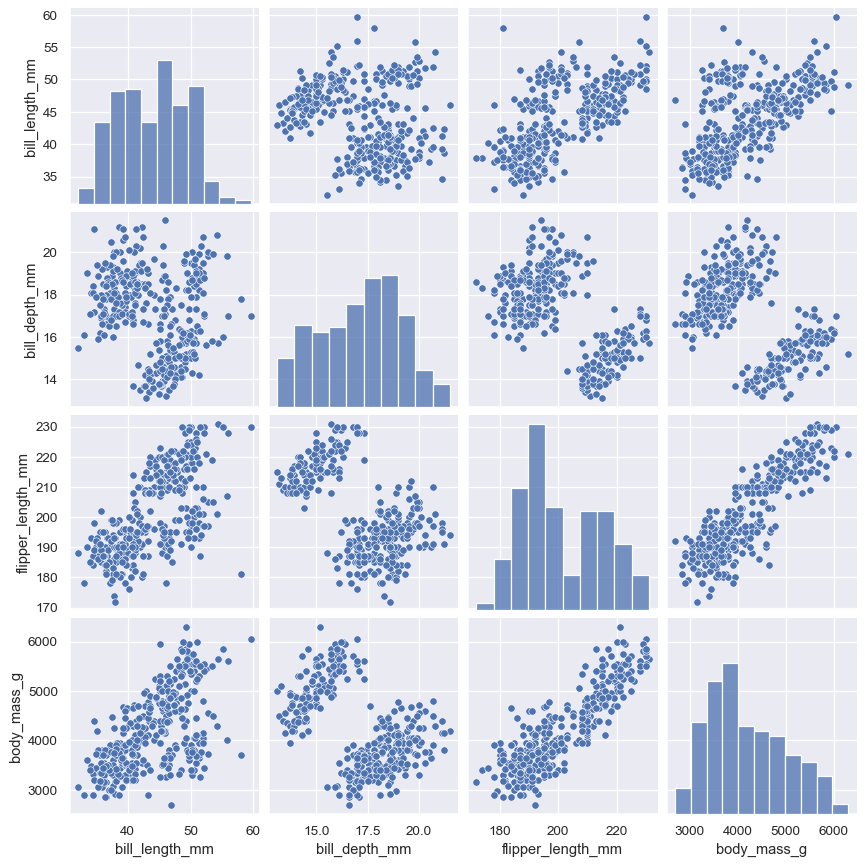
pairplot() 函數提供類似的聯合和邊際分布組合。然而, pairplot() 並不著重於單一關係上;反而是使用「小倍數」方式,視覺化資料集中所有變量的單變量分布,及其所有成對關係
sns.pairplot(penguins)
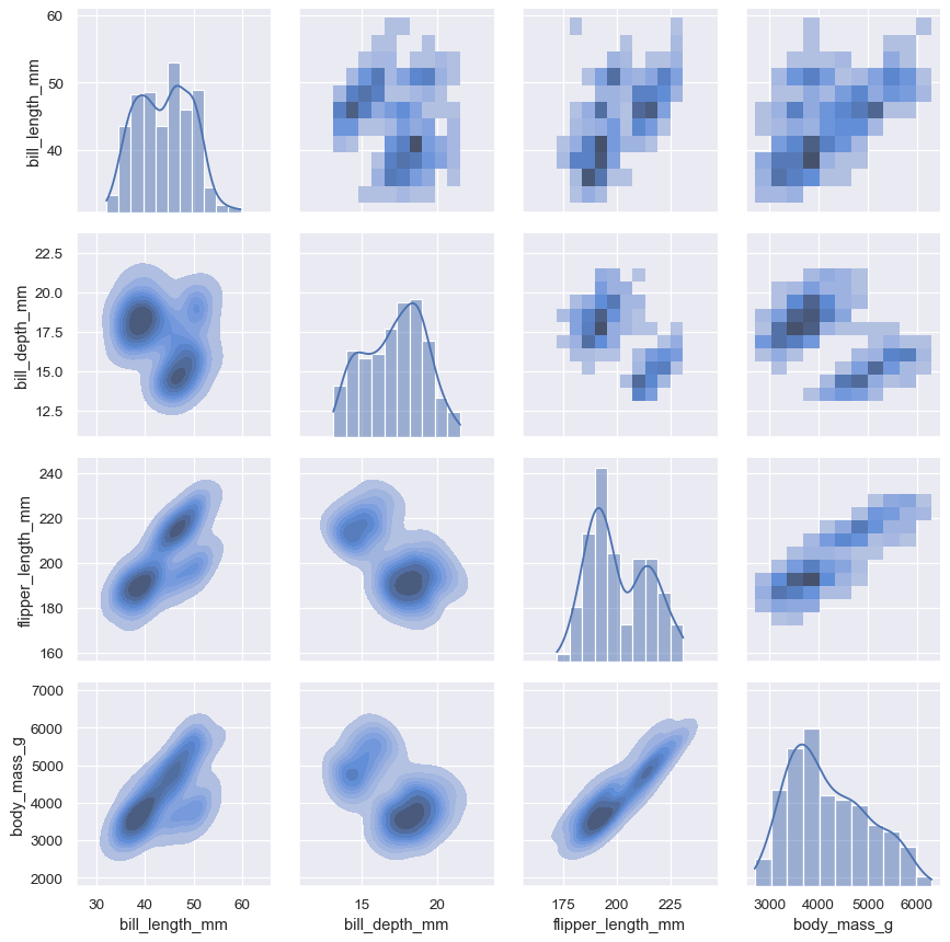
使用 jointplot()/JointGrid 時,直接使用基礎的 PairGrid 僅需多輸入一些代碼,就能帶來更高的彈性
g = sns.PairGrid(penguins)
g.map_upper(sns.histplot)
g.map_lower(sns.kdeplot, fill=True)
g.map_diag(sns.histplot, kde=True)