seaborn.jointplot#
- seaborn.jointplot(data=None, *, x=None, y=None, hue=None, kind='scatter', height=6, ratio=5, space=0.2, dropna=False, xlim=None, ylim=None, color=None, palette=None, hue_order=None, hue_norm=None, marginal_ticks=False, joint_kws=None, marginal_kws=None, **kwargs)#
繪製兩個變數的圖表,包含雙變數和單變數圖形。
此函數提供了方便的介面來操作
JointGrid類別,並提供多種預設的繪圖類型。此函數旨在作為一個相當輕量的包裝器;如果您需要更高的彈性,您應該直接使用JointGrid。- 參數:
- data
pandas.DataFrame,numpy.ndarray, 映射或序列 輸入資料結構。可以是可指定給命名變數的長格式向量集合,或是將在內部重新塑形的寬格式資料集。
- x, y向量或
data中的鍵 指定 x 和 y 軸位置的變數。
- hue向量或
data中的鍵 用於決定繪圖元素顏色的語義變數。
- kind{ “scatter” | “kde” | “hist” | “hex” | “reg” | “resid” }
要繪製的圖表種類。請參閱範例以取得底層函數的參考資訊。
- height數值
圖形大小(將為正方形)。
- ratio數值
聯合軸高度與邊緣軸高度的比率。
- space數值
聯合軸和邊緣軸之間的間距
- dropna布林值
若為 True,則從
x和y中移除遺失的觀測值。- {x, y}lim數值對
在繪圖前要設定的軸限制。
- color
matplotlib color 未使用 hue 映射時的單一顏色規格。否則,繪圖將嘗試連結到 matplotlib 屬性循環。
- palette字串、列表、字典或
matplotlib.colors.Colormap 當映射
hue語義時,用於選擇顏色的方法。字串值會傳遞至color_palette()。列表或字典值表示分類映射,而色彩映射物件表示數值映射。- hue_order字串向量
指定
hue語義的分類層級的處理和繪圖順序。- hue_norm元組或
matplotlib.colors.Normalize 設定資料單位中正規化範圍的一對數值,或將資料單位映射到 [0, 1] 區間的物件。使用表示數值映射。
- marginal_ticks布林值
若為 False,則隱藏邊緣繪圖的計數/密度軸上的刻度。
- {joint, marginal}_kws字典
繪圖元件的其他關鍵字引數。
- kwargs
其他關鍵字引數會傳遞給用於在聯合軸上繪製圖表的函數,並取代
joint_kws字典中的項目。
- data
- 傳回值:
JointGrid管理多個子圖的物件,這些子圖對應於用於繪製雙變數關係或分佈的聯合軸和邊緣軸。
範例
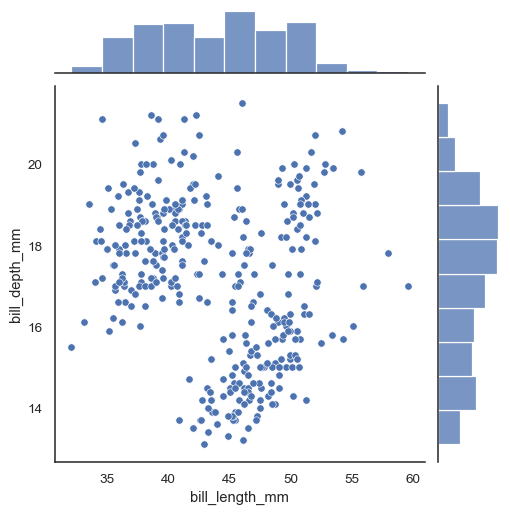
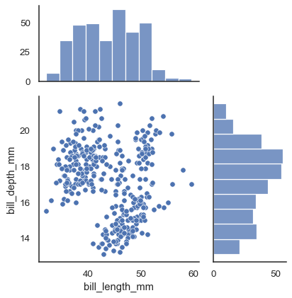
在最簡單的調用中,指定
x和y來建立散佈圖(使用scatterplot()),並附帶邊緣直方圖(使用histplot())。penguins = sns.load_dataset("penguins") sns.jointplot(data=penguins, x="bill_length_mm", y="bill_depth_mm")
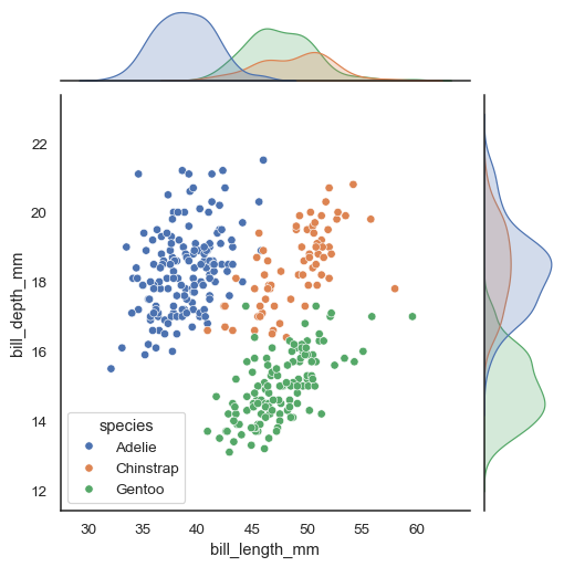
指定
hue變數將會為散佈圖添加條件顏色,並在邊緣軸上繪製個別的密度曲線(使用kdeplot())。sns.jointplot(data=penguins, x="bill_length_mm", y="bill_depth_mm", hue="species")
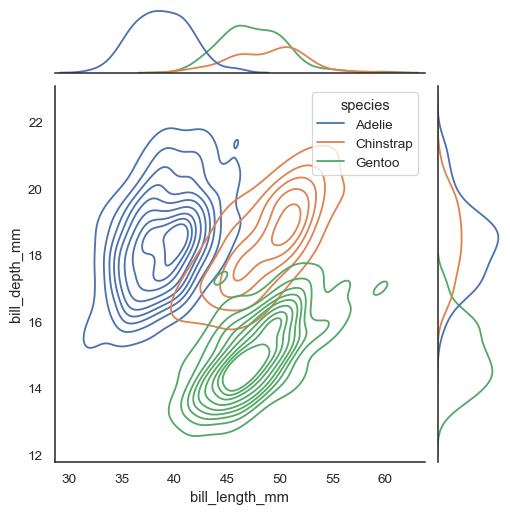
透過
kind參數,可以使用幾種不同的繪圖方法。設定kind="kde"將會繪製雙變量和單變量的 KDE。sns.jointplot(data=penguins, x="bill_length_mm", y="bill_depth_mm", hue="species", kind="kde")
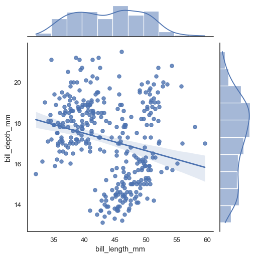
設定
kind="reg"來添加線性迴歸擬合(使用regplot())和單變量 KDE 曲線。sns.jointplot(data=penguins, x="bill_length_mm", y="bill_depth_mm", kind="reg")
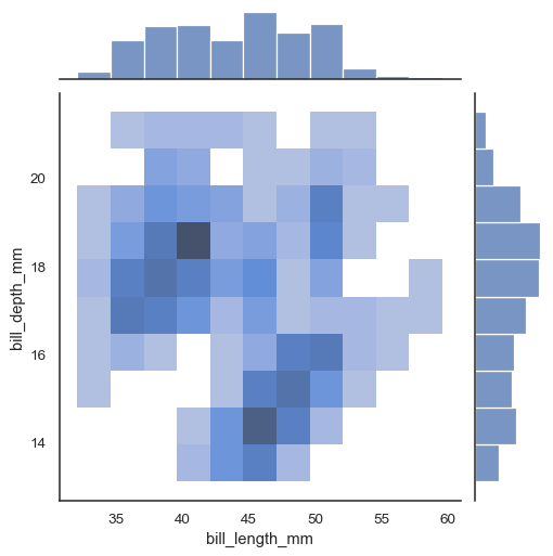
還有兩種選項可針對聯合分佈進行基於 bin 的視覺化。第一種,使用
kind="hist",會在所有軸上使用histplot()。sns.jointplot(data=penguins, x="bill_length_mm", y="bill_depth_mm", kind="hist")
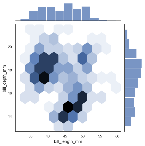
或者,設定
kind="hex"將會使用matplotlib.axes.Axes.hexbin()來計算使用六邊形 bin 的雙變量直方圖。sns.jointplot(data=penguins, x="bill_length_mm", y="bill_depth_mm", kind="hex")
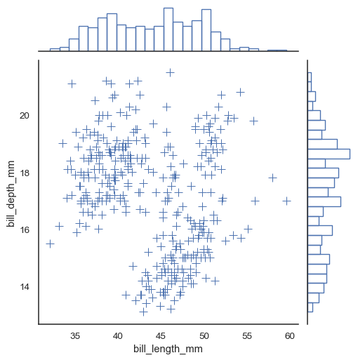
額外的關鍵字引數可以傳遞給底層的繪圖函數。
sns.jointplot(
    data=penguins, x="bill_length_mm", y="bill_depth_mm",
    marker="+", s=100, marginal_kws=dict(bins=25, fill=False),
)
使用
JointGrid參數來控制圖形的大小和佈局。sns.jointplot(data=penguins, x="bill_length_mm", y="bill_depth_mm", height=5, ratio=2, marginal_ticks=True)
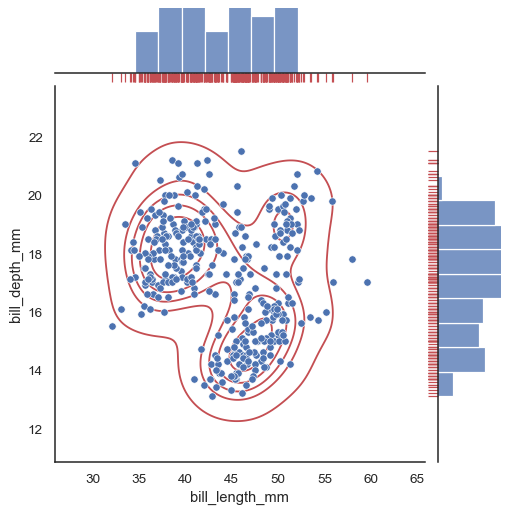
若要向繪圖添加更多圖層,請使用
jointplot()回傳的JointGrid物件上的方法。g = sns.jointplot(data=penguins, x="bill_length_mm", y="bill_depth_mm") g.plot_joint(sns.kdeplot, color="r", zorder=0, levels=6) g.plot_marginals(sns.rugplot, color="r", height=-.15, clip_on=False)