seaborn.JointGrid.__init__#
- JointGrid.__init__(data=None, *, x=None, y=None, hue=None, height=6, ratio=5, space=0.2, palette=None, hue_order=None, hue_norm=None, dropna=False, xlim=None, ylim=None, marginal_ticks=False)#
設定子圖的網格,並在內部儲存資料以方便繪圖。
- 參數:
- data
pandas.DataFrame、numpy.ndarray、對應或序列 輸入資料結構。可以是可指定給命名變數的長格式向量集合,或是將在內部重新塑形的寬格式資料集。
- x, y
data中的向量或鍵 指定 x 軸和 y 軸位置的變數。
- height數字
圖形每一邊的大小,以英寸為單位(會是正方形)。
- ratio數字
聯合軸高度與邊緣軸高度的比率。
- space數字
聯合軸與邊緣軸之間的空間
- dropna布林值
如果為 True,則在繪圖前移除遺失的觀察值。
- {x, y}lim數字對
在繪圖前將軸限制設定為這些值。
- marginal_ticks布林值
如果為 False,則抑制邊緣圖的計數/密度軸上的刻度。
- hue
data中的向量或鍵 對應到繪圖元素顏色以確定其顏色的語義變數。請注意:與
FacetGrid或PairGrid不同,軸級函數必須支援hue才能在JointGrid中使用。- palette字串、清單、字典或
matplotlib.colors.Colormap 用於在對應
hue語義時選擇要使用顏色的方法。字串值會傳遞給color_palette()。清單或字典值表示類別對應,而顏色對應物件表示數值對應。- hue_order字串向量
指定處理和繪製
hue語義的類別層級的順序。- hue_norm元組或
matplotlib.colors.Normalize 一對數值,設定資料單位中的標準化範圍,或是一個物件,將資料單位對應到 [0, 1] 區間。使用時表示數值對應。
- data
範例
呼叫建構函式會初始化圖形,但不會繪製任何內容
penguins = sns.load_dataset("penguins")
sns.JointGrid(data=penguins, x="bill_length_mm", y="bill_depth_mm")
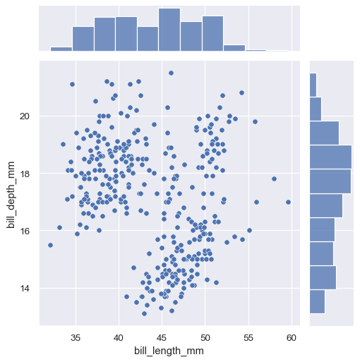
最簡單的繪圖方法
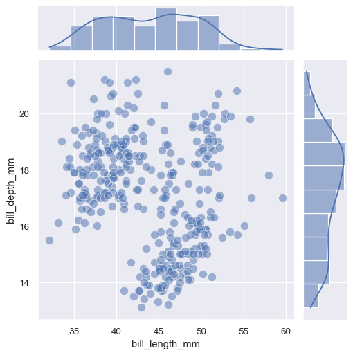
JointGrid.plot()接受一對函數(一個用於聯合軸,另一個用於兩個邊緣軸)g = sns.JointGrid(data=penguins, x="bill_length_mm", y="bill_depth_mm") g.plot(sns.scatterplot, sns.histplot)
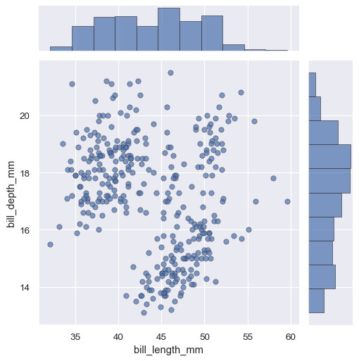
JointGrid.plot()函數也接受其他關鍵字引數,但會將它們傳遞給兩個函數g = sns.JointGrid(data=penguins, x="bill_length_mm", y="bill_depth_mm") g.plot(sns.scatterplot, sns.histplot, alpha=.7, edgecolor=".2", linewidth=.5)
如果需要將不同的關鍵字引數傳遞給每個函數,則必須調用
JointGrid.plot_joint()和JointGrid.plot_marginals()g = sns.JointGrid(data=penguins, x="bill_length_mm", y="bill_depth_mm") g.plot_joint(sns.scatterplot, s=100, alpha=.5) g.plot_marginals(sns.histplot, kde=True)
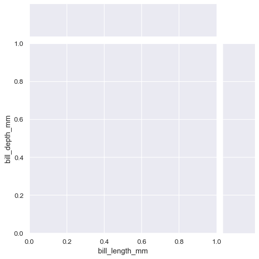
您也可以在不指定任何資料的情況下設定網格
g = sns.JointGrid()
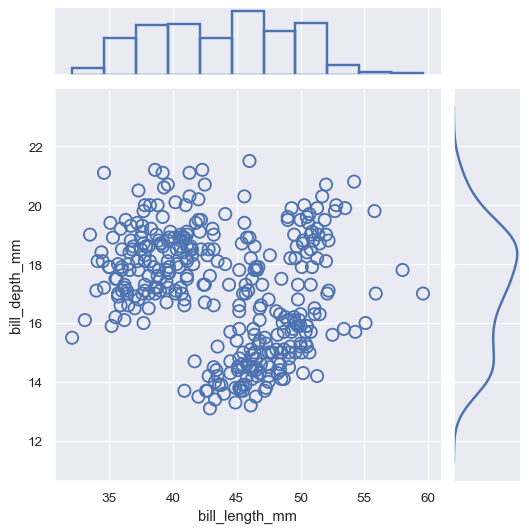
然後,您可以透過存取
ax_joint、ax_marg_x和ax_marg_y屬性來繪圖,這些屬性都是matplotlib.axes.Axes物件。g = sns.JointGrid() x, y = penguins["bill_length_mm"], penguins["bill_depth_mm"] sns.scatterplot(x=x, y=y, ec="b", fc="none", s=100, linewidth=1.5, ax=g.ax_joint) sns.histplot(x=x, fill=False, linewidth=2, ax=g.ax_marg_x) sns.kdeplot(y=y, linewidth=2, ax=g.ax_marg_y)
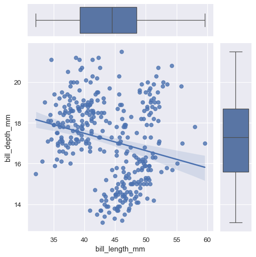
繪圖方法可以使用任何接受
x和y變數的 seaborn 函式。g = sns.JointGrid(data=penguins, x="bill_length_mm", y="bill_depth_mm") g.plot(sns.regplot, sns.boxplot)
如果函式接受
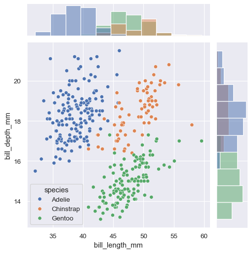
hue變數,您可以在呼叫建構子時指定hue來使用它。g = sns.JointGrid(data=penguins, x="bill_length_mm", y="bill_depth_mm", hue="species") g.plot(sns.scatterplot, sns.histplot)
可以使用 :meth:
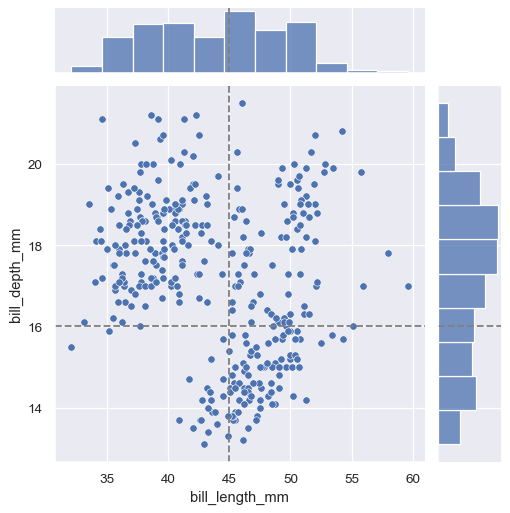
JointGrid.refline將水平和/或垂直參考線新增到聯合和/或邊緣軸。g = sns.JointGrid(data=penguins, x="bill_length_mm", y="bill_depth_mm") g.plot(sns.scatterplot, sns.histplot) g.refline(x=45, y=16)
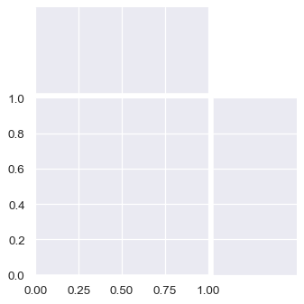
圖形將始終為正方形(除非您在 matplotlib 層調整其大小),但其整體大小和佈局是可配置的。大小由
height參數控制。聯合軸和邊緣軸之間的相對比例由ratio控制,而圖表之間的間距量由space控制。sns.JointGrid(height=4, ratio=2, space=.05)
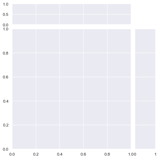
預設情況下,邊緣圖的密度軸上的刻度會關閉,但這是可配置的。
sns.JointGrid(marginal_ticks=True)
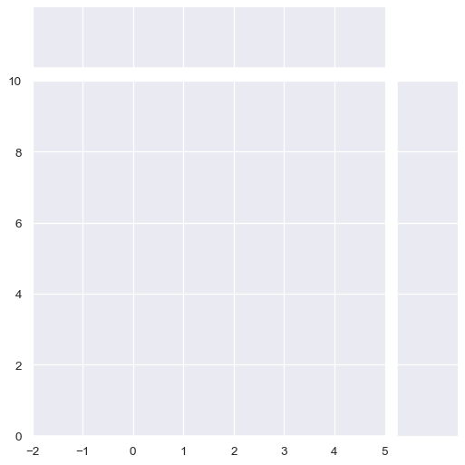
在設定圖形時,也可以定義兩個資料軸(在圖表之間共享)的限制。
sns.JointGrid(xlim=(-2, 5), ylim=(0, 10))