視覺化分類資料#
在 關係繪製教學 中,我們認識了如何使用不同的視覺化呈現來顯示資料集中多重變數之間的關係。在範例中,我們專注於主要關係為兩個數字變數之間的案例。如果其中一個主要變數是「分類的」(劃分為數個區段),則使用更專業的視覺化方式可能會有所助益。
在 seaborn 中,有許多不同的方式可以視覺化包含分類資料的關係。類似 relplot() 與 scatterplot() 或 lineplot() 之間的關係,有兩種方法可以繪製這些圖。有許多軸層級函式可以以不同的方式繪製分類資料,以及一個圖層級介面 catplot(),提供統一的高層級存取方式。
不妨將不同的分類繪製類別視為屬於三個不同的類型,我們將在下面詳細討論。它們是
分類散佈圖
stripplot()(使用kind="strip";預設)swarmplot()(搭配kind="swarm")
類別分布區塊
boxplot()(搭配kind="box")violinplot()(搭配kind="violin")boxenplot()(搭配kind="boxen")
類別預估區塊
pointplot()(搭配kind="point")barplot()(搭配kind="bar")countplot()(搭配kind="count")
這些族群以具有不同層級粒度的資料表示。決定要使用哪一種時,您必須考量要回答的問題為何。使用統一的 API 可以輕易在不同的類型之間切換,並且從不同的觀點觀察資料。
在本教學課程中,我們主要著重在 figures 層級的介面,catplot()。請記住,此函式是上述各函式的較高層級介面,因此我們在展示每種類型的區塊時會參照它們,並保留較冗長的 kind 類型特定 API 文件。
類別散佈圖#
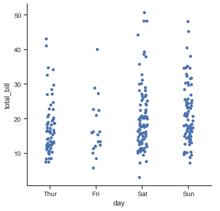
在 catplot() 中資料的預設表示法使用散佈圖。在 Seaborn 中實際上有兩種不同的分類散佈圖。它們採取不同方式來解決使用散佈圖表示分類資料的主要挑戰,也就是屬於同一個分類的所有點會落在與分類變數對應的軸上的同一位置。由 stripplot() 使用的方法(它是 catplot() 中預設的「種類」)是用一定程度隨機「抖動」來調整點在分類軸上的位置
tips = sns.load_dataset("tips")
sns.catplot(data=tips, x="day", y="total_bill")
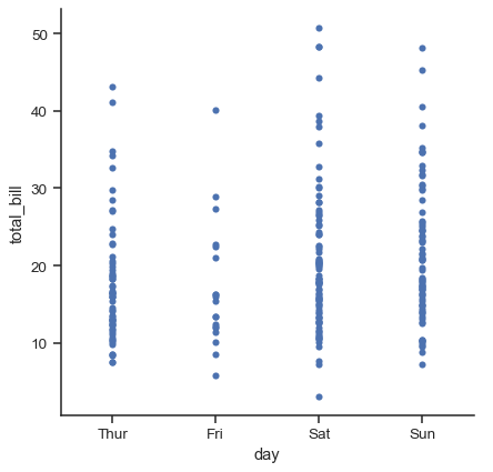
抖動 參數控制抖動的大小或將其全部關閉
sns.catplot(data=tips, x="day", y="total_bill", jitter=False)
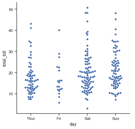
第二種方法使用一種演算法來調整分類軸上的點,以避免它們重疊。儘管這類圖形僅對相對較小的資料集有效,但它可以更有效地表示觀測值的分配。有時這種圖形稱為「蜂群」,並由 swarmplot() 繪製在 Seaborn 中,而 catplot() 中透過設定 種類="swarm" 來啟用它
sns.catplot(data=tips, x="day", y="total_bill", kind="swarm")
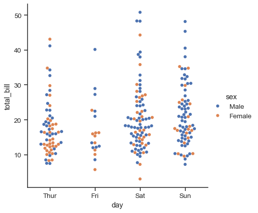
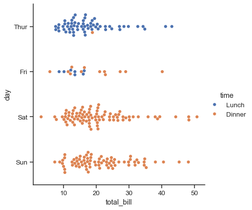
類似於關係圖,可以在分類圖中使用 色彩 語義來增加另一個維度。(分類圖目前不支援 大小 或 樣式 語義)。每個不同的分類繪製函式處理 色彩 語義的方式不同。對於散佈圖來說,只需變更點的顏色即可
sns.catplot(data=tips, x="day", y="total_bill", hue="sex", kind="swarm")
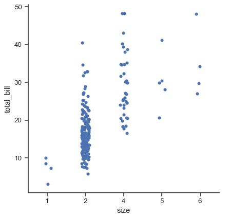
與數值資料不同,分類變數不同層級沿其座標軸的順序並非總是顯而易見。一般來說,seaborn 分類繪圖函式會嘗試從資料中推論分類的順序。如果資料有 pandas Categorical 資料型別,則可以設定分類的預設順序。如果傳遞到分類座標軸的變數看起來是數值的,那麼層級會被排序。不過,即使使用數字標籤,在預設情況下資料仍會被視為分類資料,並以序數位置繪製在分類座標軸上(特別是,在 0、1、... 處)
sns.catplot(data=tips.query("size != 3"), x="size", y="total_bill")
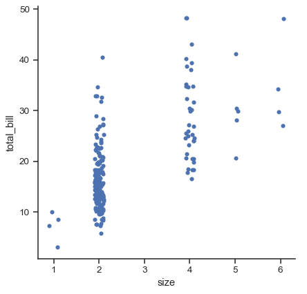
從 v0.13.0 起,所有分類繪圖函式都有 native_scale 參數,可以在不改變底層資料屬性的情況下,使用數字或日期時間資料進行分類分組時將其設為 True
sns.catplot(data=tips.query("size != 3"), x="size", y="total_bill", native_scale=True)
選擇預設排序的另一種選項是按照層級在資料集中出現的順序取用分類層級。也可使用 order 參數針對特定繪圖控制排序。在同一個圖形中繪製多個分類繪圖時,這一點很重要,我們稍後會看到更多相關內容
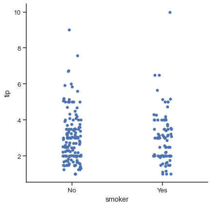
sns.catplot(data=tips, x="smoker", y="tip", order=["No", "Yes"])
我們提到了「分類座標軸」的概念。在這些範例中,這始終與橫軸相符。但將分類變數置於縱軸上(特別是在類別名稱相對較長或類別很多時)通常很有幫助。為此,請交換變數對應到座標軸的指派
sns.catplot(data=tips, x="total_bill", y="day", hue="time", kind="swarm")
比較分配#
隨著資料集大小增長,分類散佈圖在提供每個類別中值分配資訊方面的能力會受到限制。當發生這種情況時,有幾種方法可以用於總結分配資訊,以利於在類別層級間進行輕鬆比較。
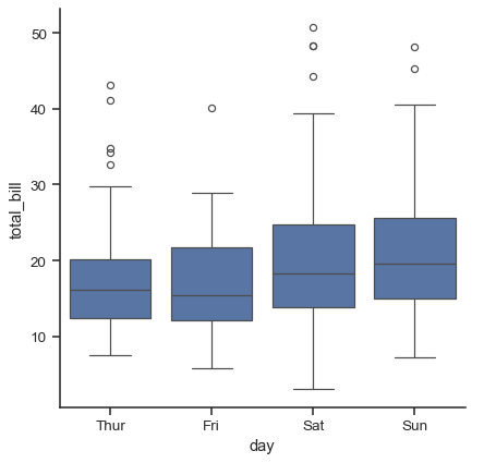
箱型圖#
第一個是大家熟知的 boxplot()。這類型的繪圖會顯示分配的三個四分位數值以及極端值。「鬚鬚」延伸到距離上下四分位數 1.5 倍 IQR 內的點,然後將超出此範圍的觀察值獨立顯示。這表示箱型圖中的每一個值都對應資料中的實際觀察值。
sns.catplot(data=tips, x="day", y="total_bill", kind="box")
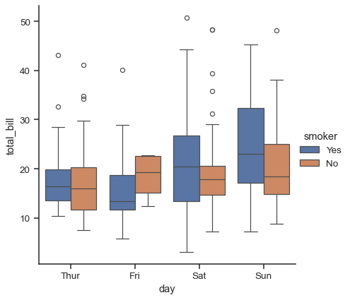
在新增 hue 語意時,每個語意變數層級的箱子會縮小並沿分類座標軸移動
sns.catplot(data=tips, x="day", y="total_bill", hue="smoker", kind="box")
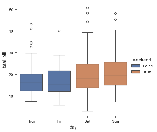
這種行為稱為「避讓」,受 dodge 參數控制。預設情況下(截至 v0.13.0),只有元素否則會重疊時才會避讓
tips["weekend"] = tips["day"].isin(["Sat", "Sun"])
sns.catplot(data=tips, x="day", y="total_bill", hue="weekend", kind="box")
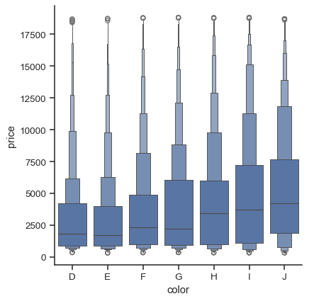
相關函式 boxenplot() 會繪製一種圖形,這種圖形類似於箱形圖,但經過最佳化以顯示更多關於機率分佈形狀的資訊。它最適合用於較大的資料集
diamonds = sns.load_dataset("diamonds")
sns.catplot(
    data=diamonds.sort_values("color"),
    x="color", y="price", kind="boxen",
)
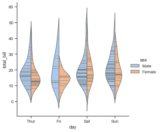
小提琴圖#
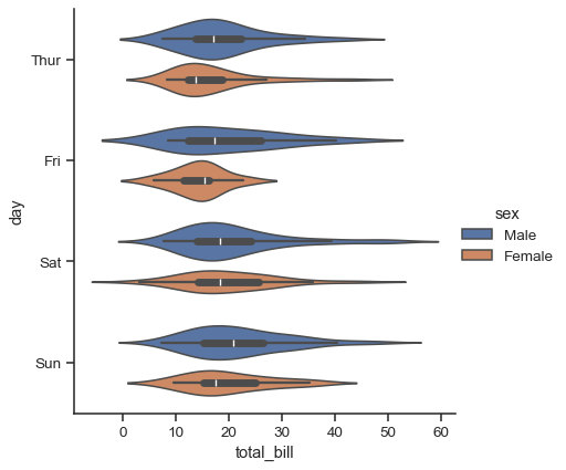
另一種做法是使用 violinplot(),這種做法會結合箱形圖以及 機率分佈教學指南中所說明的核密度估計程序
sns.catplot(
    data=tips, x="total_bill", y="day", hue="sex", kind="violin",
)
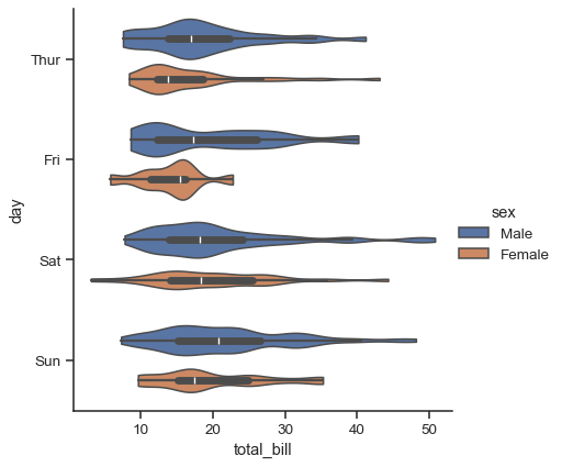
這種做法會使用核密度估計來提供更豐富的數值分佈說明。此外,箱形圖中的四分位數和鬚值的數值會顯示在小提琴圖形中。缺點是,由於小提琴圖形會使用核密度估計,因此可能會需要調整其他一些參數,這會比直截了當的箱形圖增加一些複雜度
sns.catplot(
    data=tips, x="total_bill", y="day", hue="sex",
    kind="violin", bw_adjust=.5, cut=0,
)
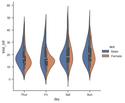
您也可以「分割」小提琴圖形,這樣可以更有效率地使用空間
sns.catplot(
    data=tips, x="day", y="total_bill", hue="sex",
    kind="violin", split=True,
)
最後,會有多種選項供您用於繪製在小提琴圖形內部的圖形,其中包含顯示每個個別觀測值(而非顯示摘要箱形圖數值)的方法
sns.catplot(
    data=tips, x="day", y="total_bill", hue="sex",
    kind="violin", inner="stick", split=True, palette="pastel",
)
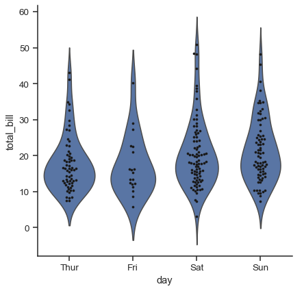
將 swarmplot() 或 stripplot() 與箱形圖或小提琴圖形結合使用,以顯示每個觀測值和分佈摘要,這也可能很有用
g = sns.catplot(data=tips, x="day", y="total_bill", kind="violin", inner=None)
sns.swarmplot(data=tips, x="day", y="total_bill", color="k", size=3, ax=g.ax)
估計中心趨勢#
對於其他應用程式,您可能希望顯示數值的中心趨勢估計值,而不是顯示每個類別內的機率分佈。Seaborn 有兩種主要方式可以顯示此資訊。重要的是,這些函式的基本 API 與上面所討論的函式相同。
長條圖#
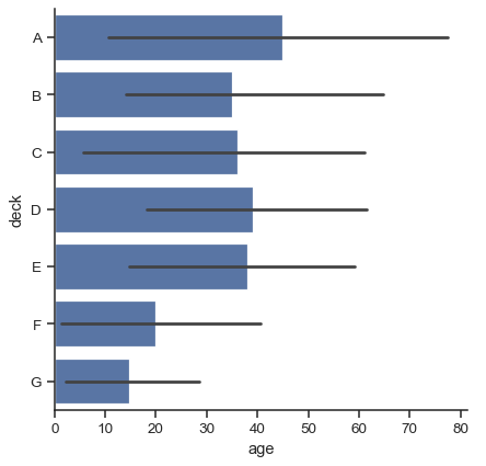
可以達成此目標的常見圖形樣式是長條圖。在 Seaborn 中,barplot() 函式會運作於一個完整的資料集,並套用一個函式來取得估計值(預設為取平均值)。當每個類別中有數個觀測值時,它也會使用開機取樣技術來計算估計值附近的信心區間,而這個信心區間會使用誤差長條來繪製
titanic = sns.load_dataset("titanic")
sns.catplot(data=titanic, x="sex", y="survived", hue="class", kind="bar")
預設的誤差長條會顯示 95% 的信心區間,不過(在 v0.12 版本開始),可以從其他許多表示方式中做選擇
sns.catplot(data=titanic, x="age", y="deck", errorbar=("pi", 95), kind="bar")
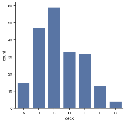
當你想要顯示每個類別中的觀察次數,而不是計算第二個變數的統計資料時,長條圖有特殊情況。這類似於定性(而不是定量)變數上的直方圖。在 Seaborn 中,使用 countplot() 函式很容易做到這一點
sns.catplot(data=titanic, x="deck", kind="count")
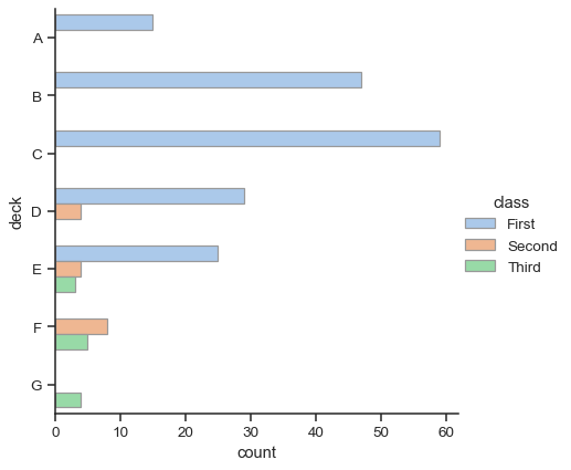
barplot() 和 countplot() 都可以隨著上述選項中的所有選項來呼叫,以及在每個函式的詳細文件中示範的其他選項
sns.catplot(
    data=titanic, y="deck", hue="class", kind="count",
    palette="pastel", edgecolor=".6",
)
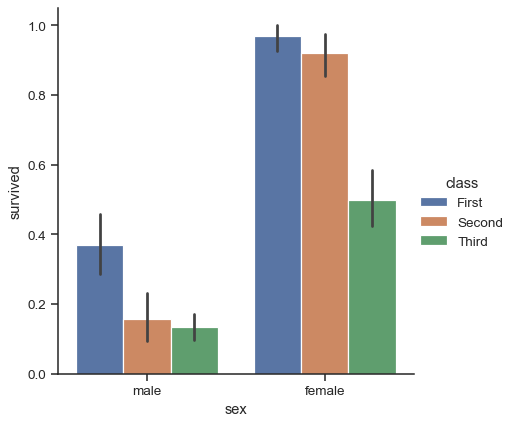
點狀圖#
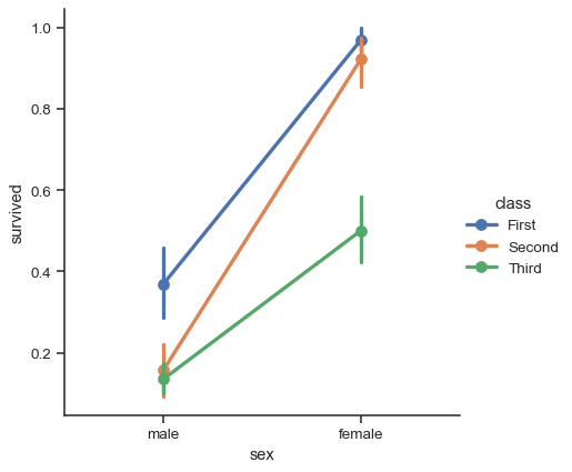
使用 pointplot() 函式,提供了一個可視化相同資訊的另類樣式。這個函式也會對應著高度上估算值的軸上的數值,不過,它並非顯示完整的長條,而是繪製點估計值和信賴區間。此外,pointplot() 會連接同一個 色調 類別的點。這使得很容易看出主關係隨著色調語意如何改變,因為你的眼睛在挑出斜率差異上相當厲害
sns.catplot(data=titanic, x="sex", y="survived", hue="class", kind="point")
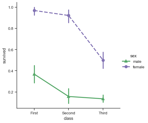
儘管類別函式缺少關係函式的 樣式 語意,改變標記和/或線型,搭配色調,仍然是一個好主意,這樣可以讓圖形在最大範圍內易於理解並在黑白中順利製作
sns.catplot(
    data=titanic, x="class", y="survived", hue="sex",
    palette={"male": "g", "female": "m"},
    markers=["^", "o"], linestyles=["-", "--"],
    kind="point"
)
顯示額外維度#
就像 relplot(),catplot() 的事實建立在 FacetGrid 之上,意思是添加分面變數以視覺化高維度關係很容易
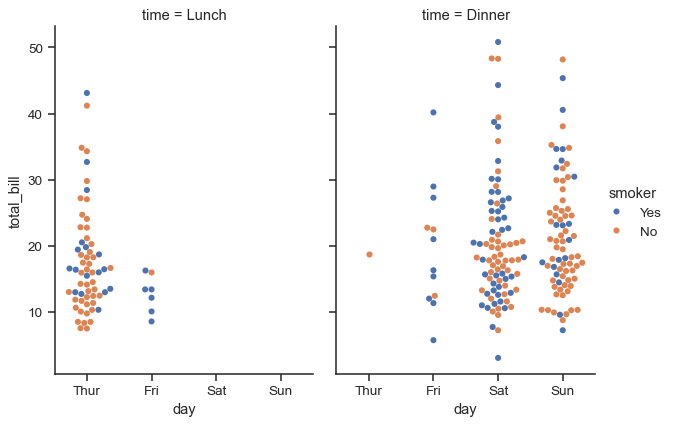
sns.catplot(
    data=tips, x="day", y="total_bill", hue="smoker",
    kind="swarm", col="time", aspect=.7,
)
若要進一步自訂圖形,可以使用它傳回的 FacetGrid 物件的方法
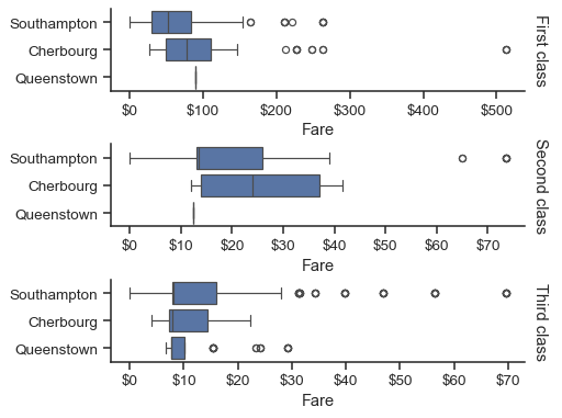
g = sns.catplot(
    data=titanic,
    x="fare", y="embark_town", row="class",
    kind="box", orient="h",
    sharex=False, margin_titles=True,
    height=1.5, aspect=4,
)
g.set(xlabel="Fare", ylabel="")
g.set_titles(row_template="{row_name} class")
for ax in g.axes.flat:
    ax.xaxis.set_major_formatter('${x:.0f}')